


Sanpo-yoshi Communication
Sanpo-yoshi Communication
Printing Column] Difficult Color Judgment
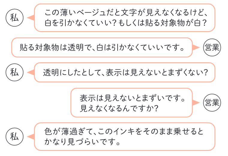
This is a common conversation with sales people when they are instructed to use light-colored PANTONE or DIC spot colors or color printing highlights (bright colors) on transparent film-based (transparent stickers) or foil paper.
The special color is created by mixing the base color (indigo, green, yellow, orange, gold-red, etc.) with medjool, a transparent ink to be diluted.

Colors other than black, gold, silver, and white are transparent and can be multiplied.
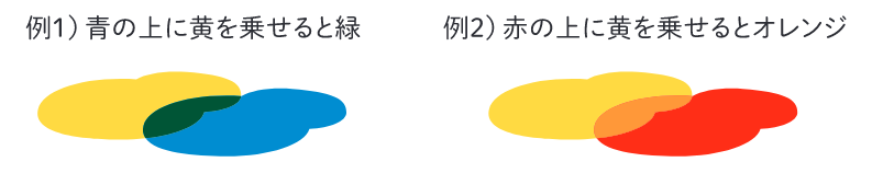
Color printing is a technique that uses these characteristics to express various colors using cyan, magenta, yellow, and complementary black inks. If the paper is transparent, the light is reflected from the other side, and the color of the container is also affected.
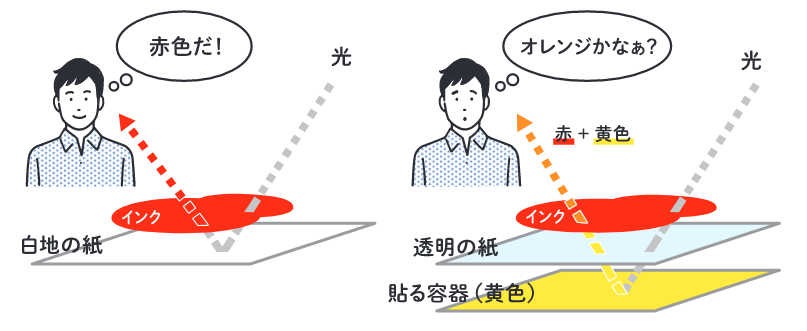
There are three ways to make light colors more visible on transparent base or foil paper
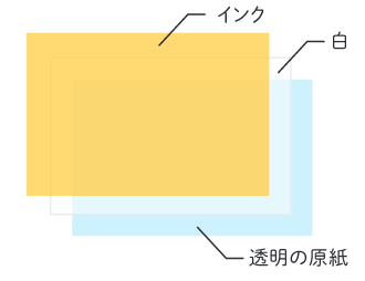
1. ink with white dots
If only 30% of the area is drawn with a mesh dot, 70% of the area is transparent. The white under the ink reflects light, making colors more visible.
2. print darker colors by reducing the number of colors in the medium
3. mix some white instead of medjool.
This sense of transparency is difficult to convey in words, so I am always lost. the "way of conveying" the knowledge and skills of printing to the younger generation is also important to build on every day.