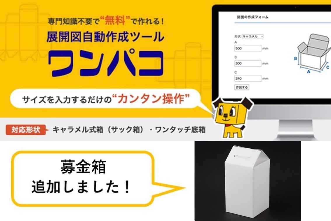


Special Printing
Differentiation by "attractive" seals and packaging
Special printing and processing using our technical capabilities
By using special printing and processing technologies, we can provide more value-added seals and
Packages can be manufactured.
Related pages for special printing
Feature
Features of Marushin's Special Printing
-
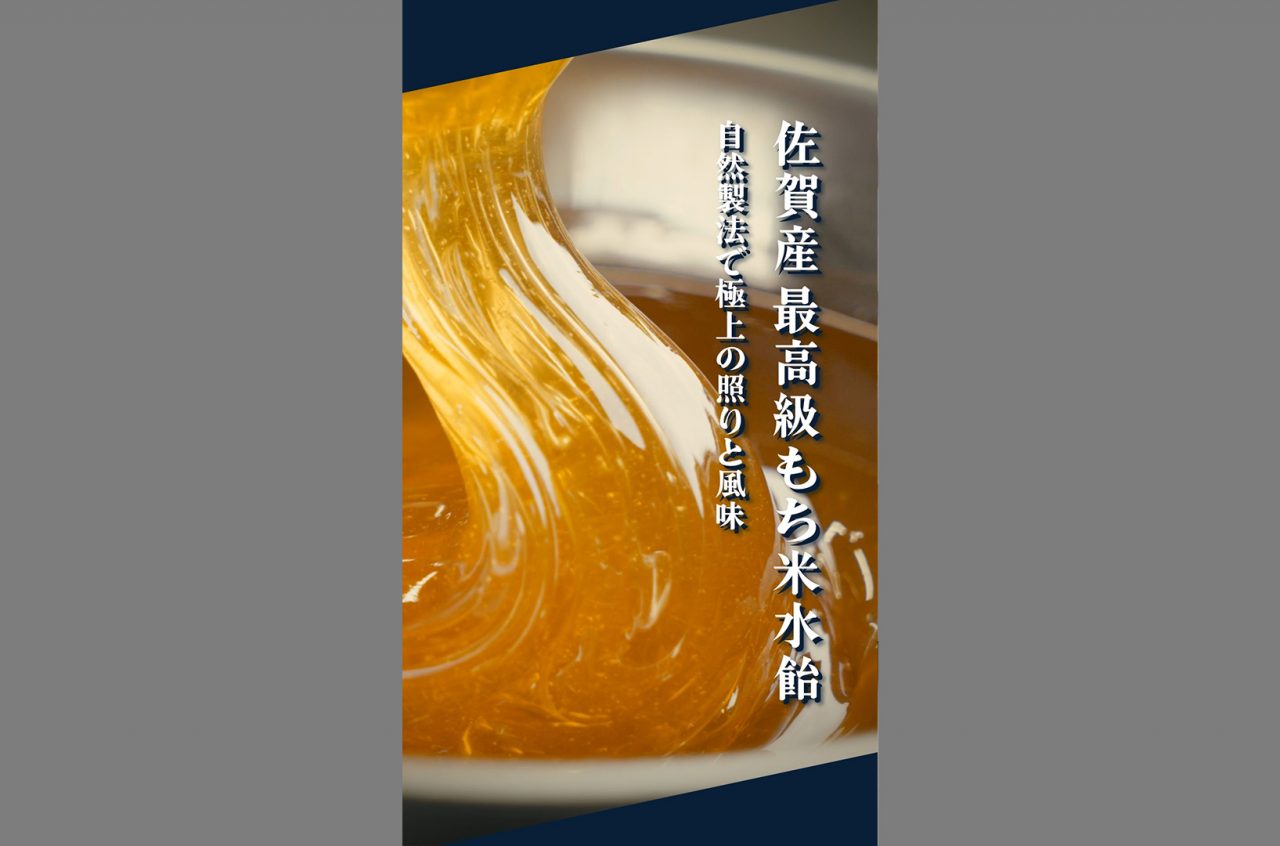
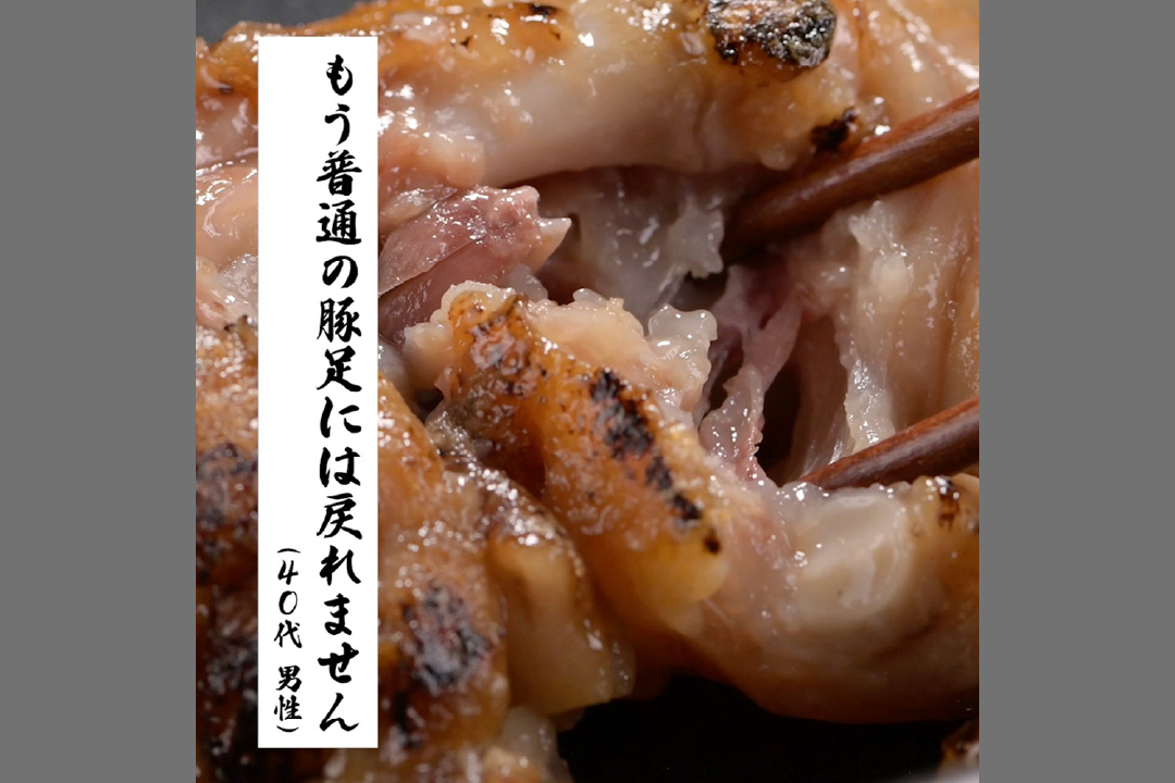
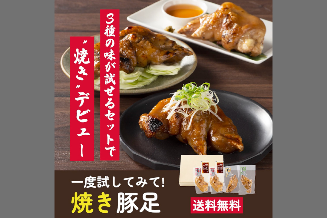
Special printing and processingValue-added products increased by
In addition to regular printing, special processing can be applied to add value to packages and stickers.
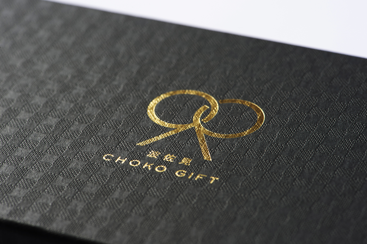
Foil stamping and embossing can express a special feeling due to the high-class image of the foil and the three-dimensional unevenness of the processed area. In addition to standard gold and silver foil, special colors and hologram foil are also available. Sizing foil processing can also be used to reproduce a more three-dimensional foil stamping.
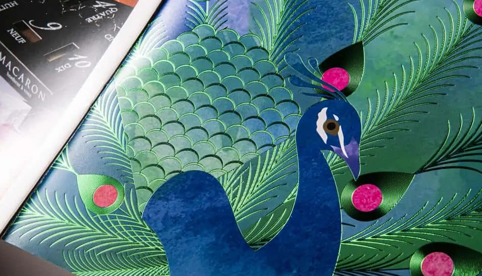
The pseudo-embossing process uses two varnishes, one for clear areas and the other for rough areas. Pseudo-embossing reproduces unevenness. As a processing method with a three-dimensional effect, we also support silk screen printing of stickers, which expresses a three-dimensional surface by applying a thick layer of ink.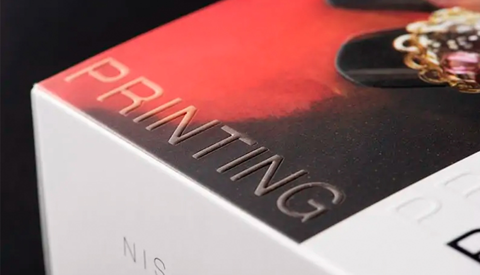
-
A wide variety of special printing and processingSupport for
We support a wide variety of special printing and processing. For packages, we offer foil stamping, embossing, pseudo-embossing, and film processing. For stickers, in addition to the same processing as for packages, we can also offer silk screen printing, riot tone processing, laser cutting, and more. We will propose the most suitable processing for our customers, taking into consideration the suitability or unsuitability of processing depending on the paper quality and design.
-
Visual onlyinstead of
also appeal to the sense of touchPackage.Pseudo-embossing is a special printing and processing that appeals to the sense of touch rather than sight. It is available for both clear and rough surfaces, and can express a pleasant texture when touched.
Three types of textures can be expressed in silk screen printing: "clear," "matte," and "riot tone. Clear" is effective when used on transparent areas. It is recommended for products that require a sizzling effect, as only the processed part is clear and three-dimensional effect can be expressed. Matte" is characterized by its moist feel and can express a moist and soft texture. Riotone" can express rough products, and is suitable for products with the texture of sand on the beach or the grain of wood on a barrel, for example.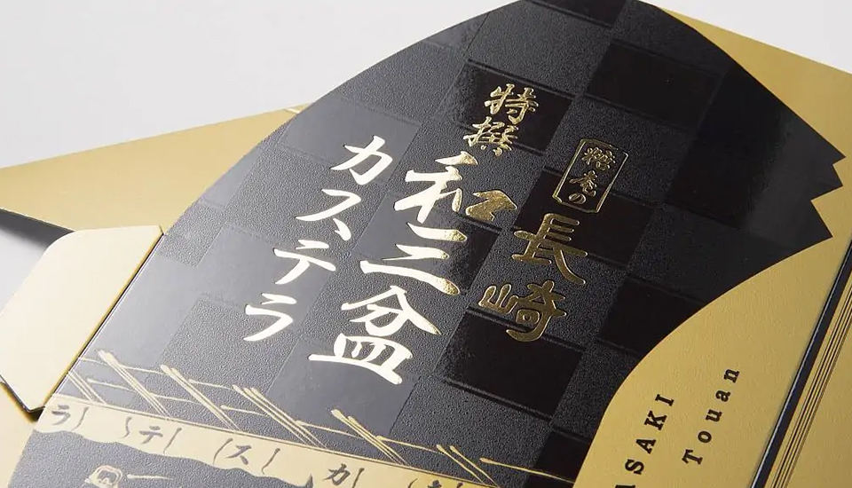
Special printing and processing available on stickers/packages
We can handle a wide variety of special printing and processing.
package
Case Studies
We can respond to a variety of applications and situations.
-
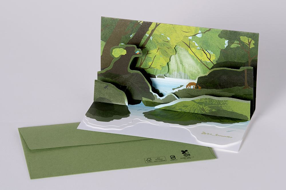
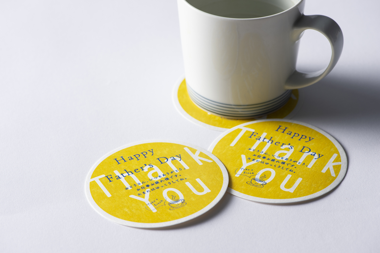
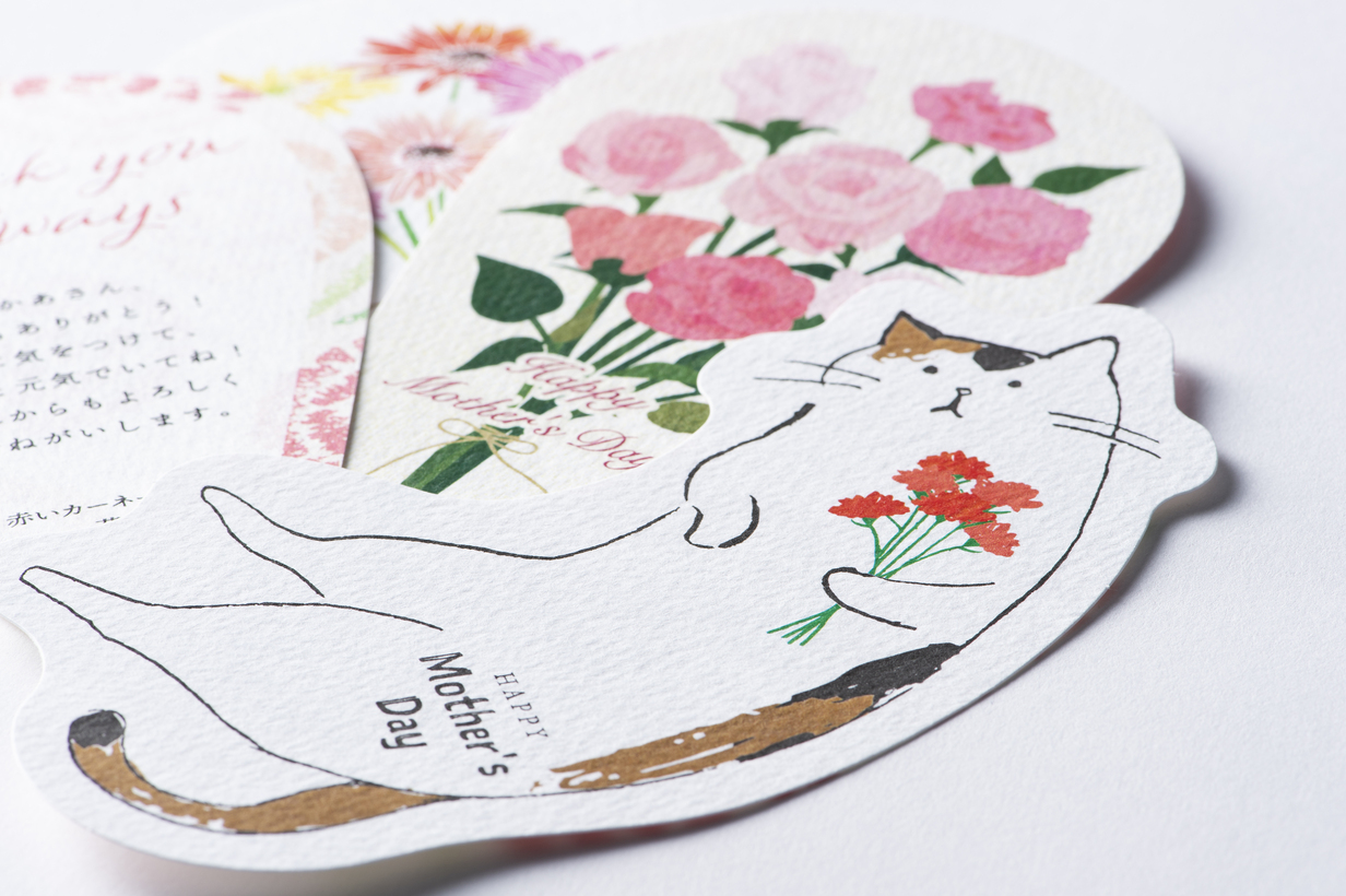
Card DM that pops up in three dimensions / Marushin
-
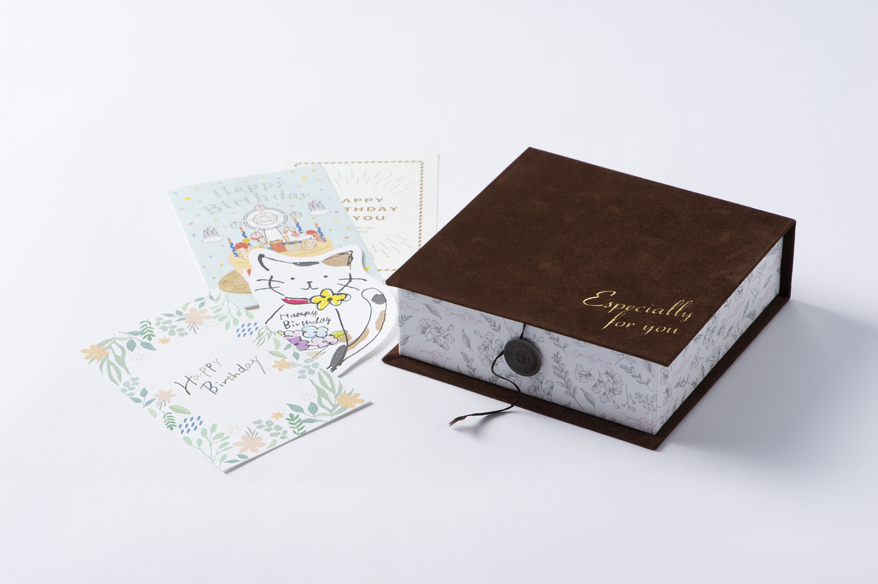
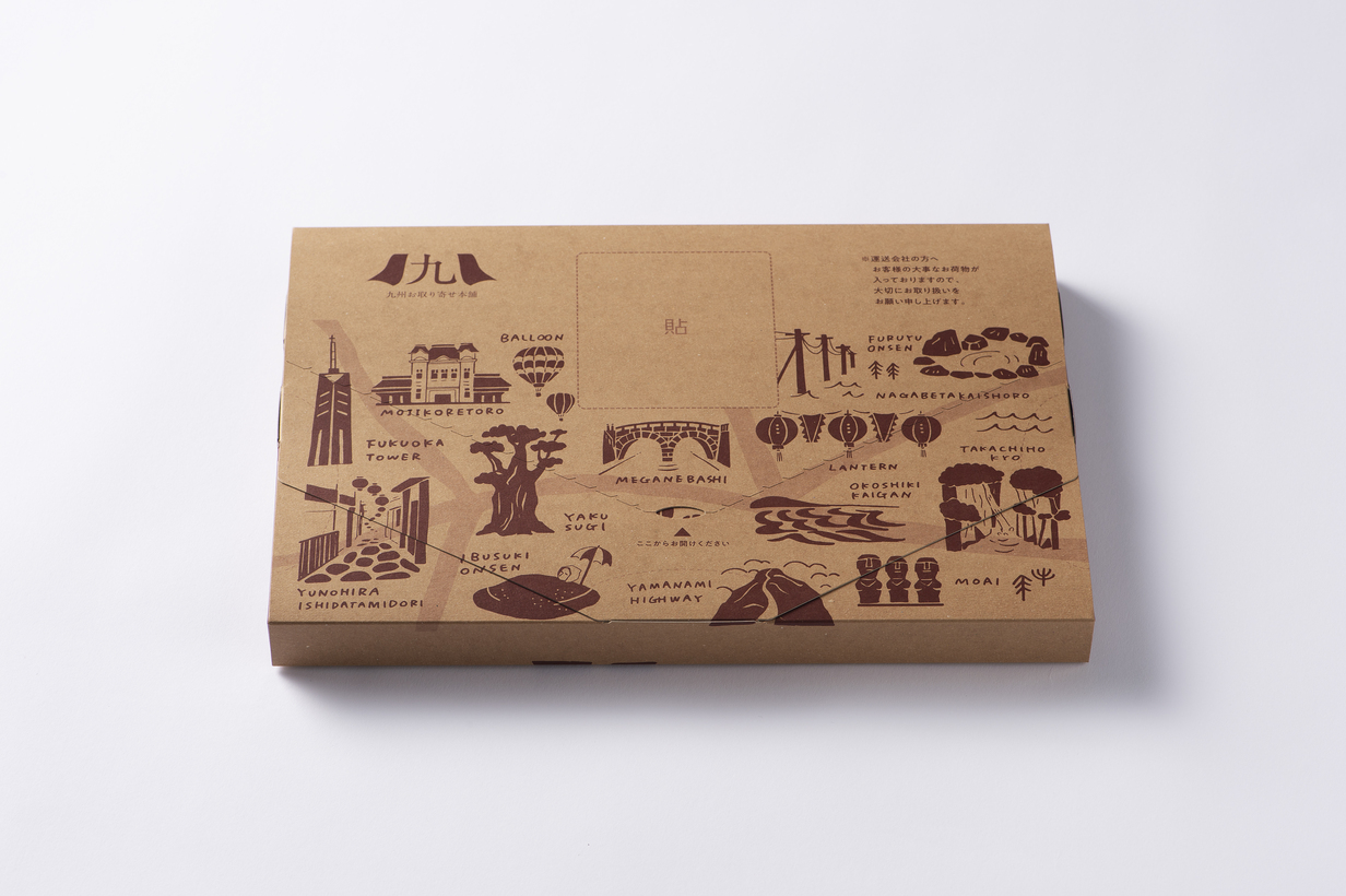
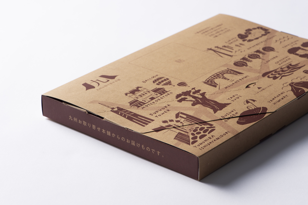
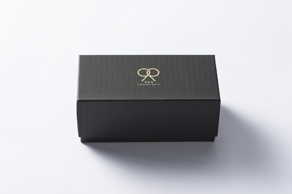
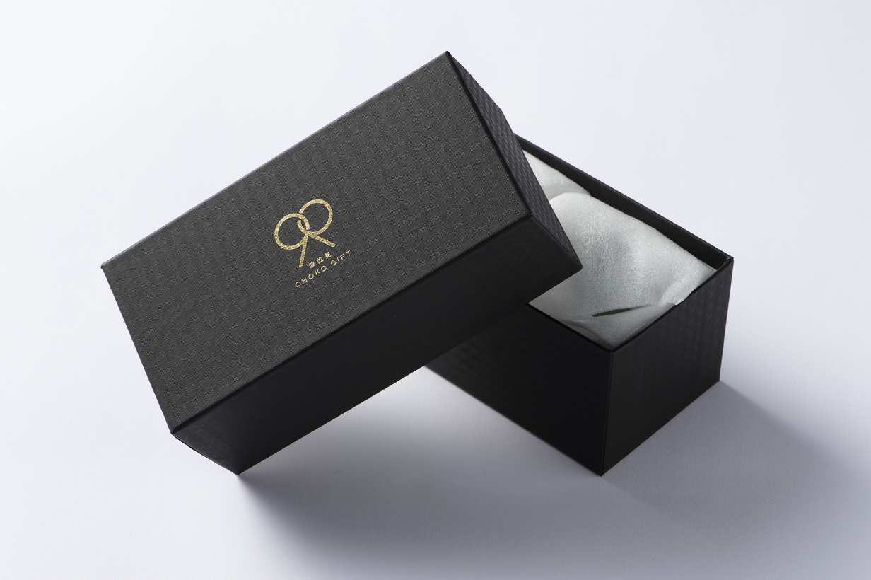
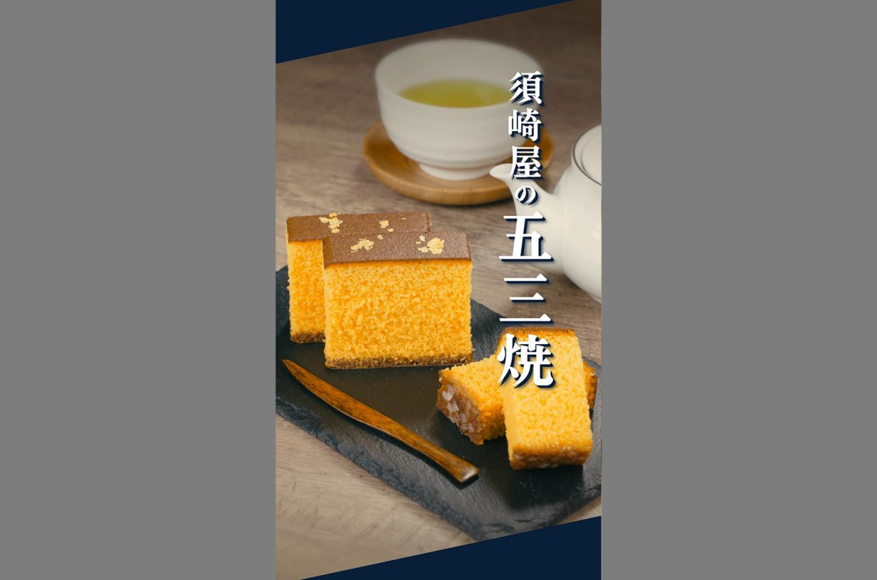
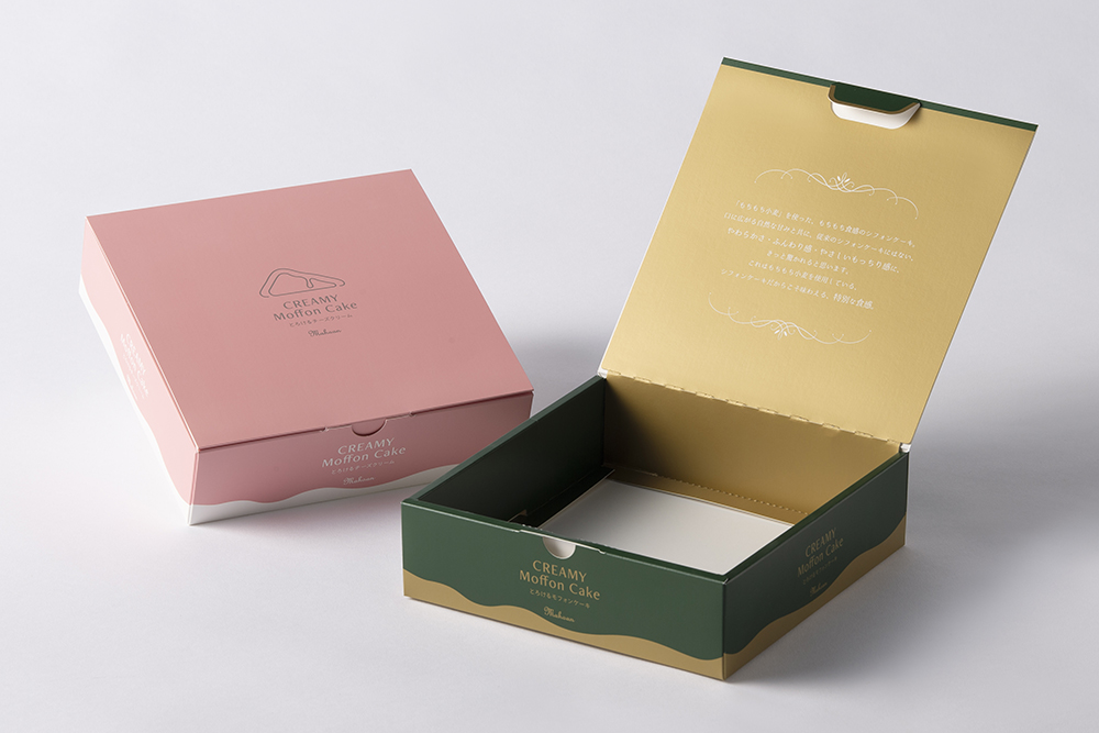
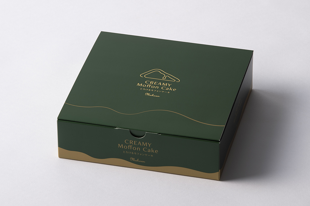
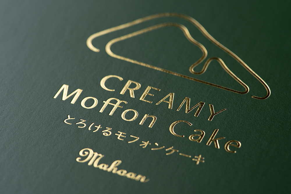
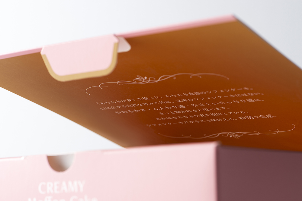
Cheesecake Gift Box / Kyushu Oretaki Honpo
-
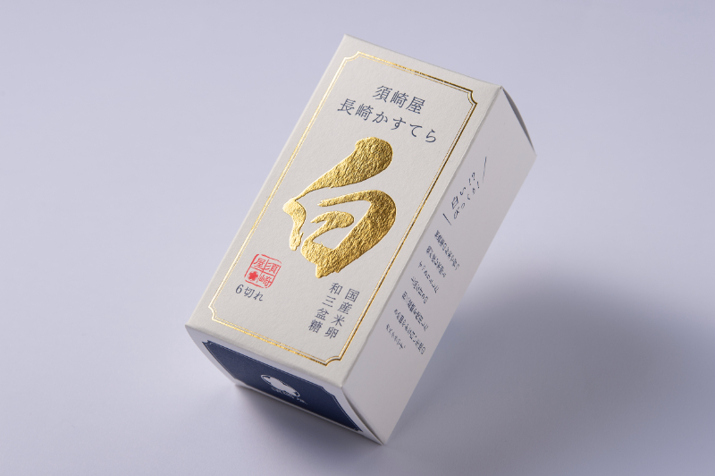
Nagasaki Castella White" package / Susakiya
Frequently Asked Questions
There are many types of foil films available.
Metallic foil
Pigment Foil
Hologram foil
For more information.this way (direction close to the speaker or towards the speaker)for more information.
Pseudo-embossing is a process that uses the repelling properties of two varnishes, UV OP varnish and UV clear varnish, to create a pseudo-embossing-like unevenness. The Riotone process is a printing method that uses a colorless, transparent ink specially designed for Riotone printing, which hardens under ultraviolet light, on the surface of ordinary printed materials. Both have a rough texture, but Riotone has a rougher texture. Riotone processing is not available for packages.
Silk printing is limited to stickers. If you want to express the thickness like silk printing on a package, we recommend the pseudo-silk printing process shown in the URL below.
Pseudo silk processing
Product pamphlet / Kowa Sangyo Co.
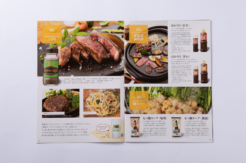
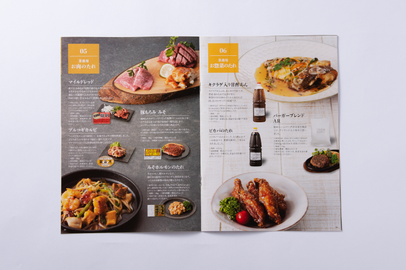
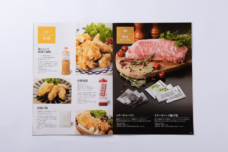
In conjunction with the renewal of the corporate website, we were asked to create a product catalog that would also serve as a company brochure that could be used as a sales tool.
Rather than simply listing products, the client wanted to focus on the layout with product images as the main focus, and also wanted to include cooking recipes.
In order to create a simple design structure with photographs as the main focus, we not only posted product package images, but also had our own photographer take sizzling, realistic photos of cooking examples in our in-house studio.
The paper used is satin Kintoki with a matte texture.
The brochure was finished exactly as requested because of the material's ability to beautifully render photographs.
Hokkai Tako Senbei (octopus cracker) bag / Sugi Seika Co.
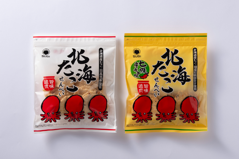
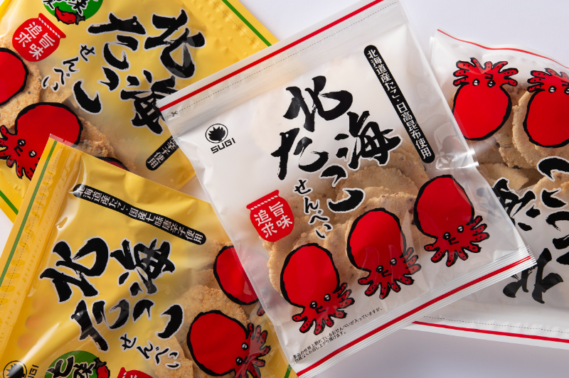
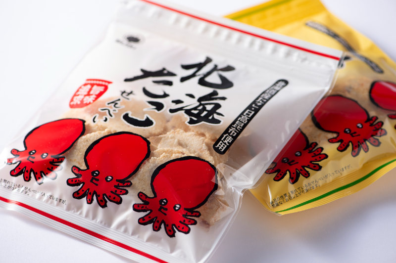
This is a mainstay product that is set to be sold at major convenience stores.
The product had been sold for a long time, but the client wanted to revamp the design to match the times and express the quality of the product.
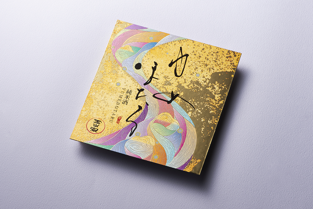
Shochu "Yumeso Tensei" label / by Hikari Shuzo
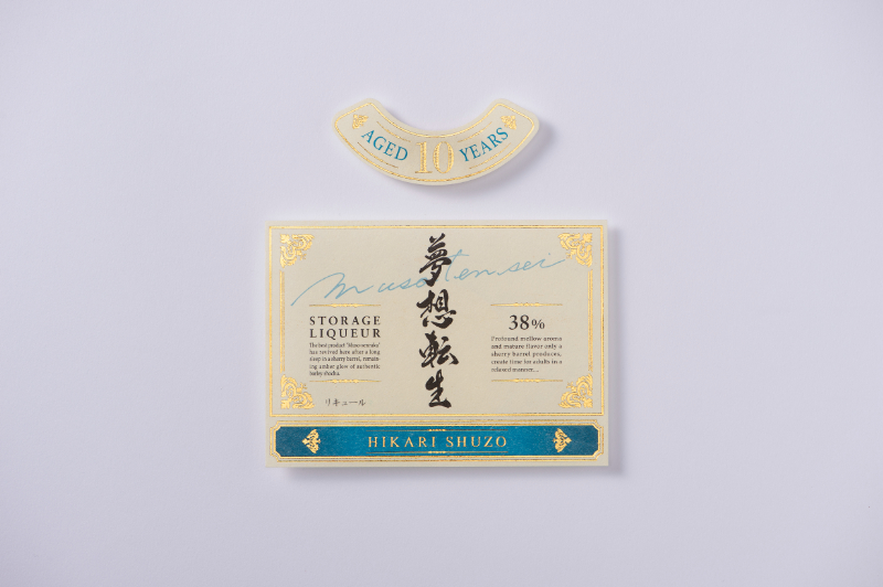
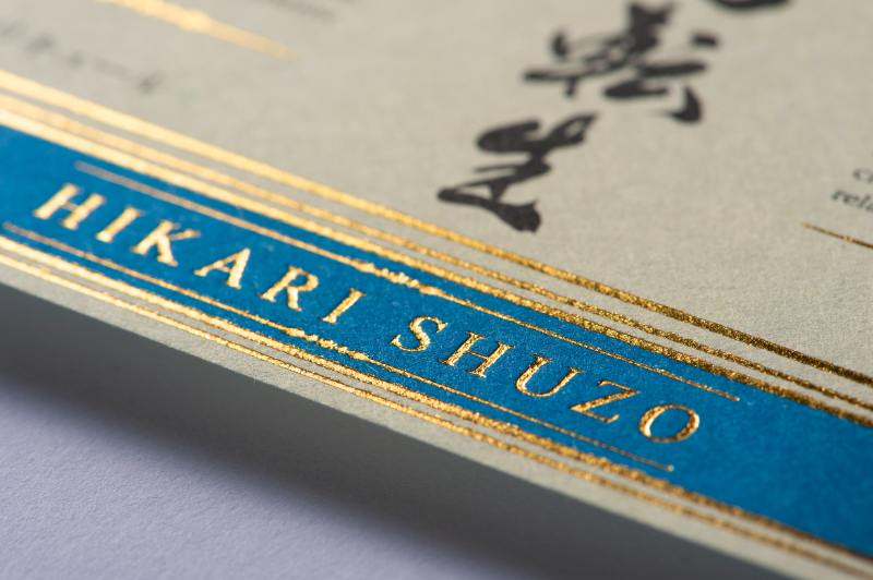
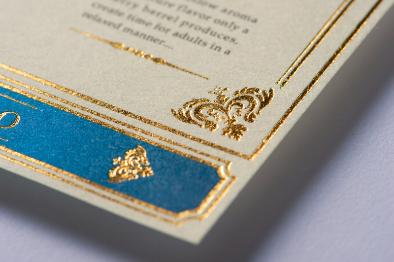
The client wanted a design using a luxurious blue color, so we first selected a base paper with high reproducibility of blue.
The colors were also carefully matched to the image through a series of prototypes in either special colors or colors.
In the final version, the original paper is white, and the background color cream is represented by printing.
The color did not sink in, and we were able to express the customer's image.
Sake "9" label / Yamaguchi Shuzo Brewery
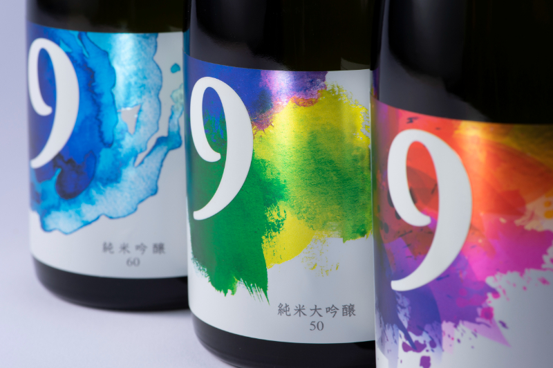
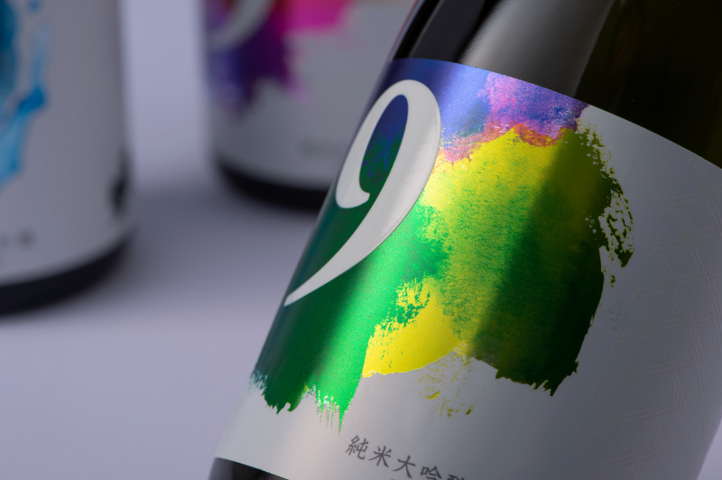
“We were asked to propose labels for three new sake products that use ”No. 9 yeast" in different proportions of rice polishing: Junmai Ginjo 60, Junmai Ginjo 50, and Junmai Ginjo 35.
With an eye toward overseas exports, the design was designed with a symbolic symbolism in mind, using the number "9" as a motif.
While evoking a distinctly Japanese culture, such as ink painting, it also expresses the primary color scheme favored overseas and the novelty of abstract painting.
Silver glossy namer is used for the base paper to create a metallic look.
We appreciate the unique design.
Label for coffee bag / Kotobukiya Coffee Beverage Co.
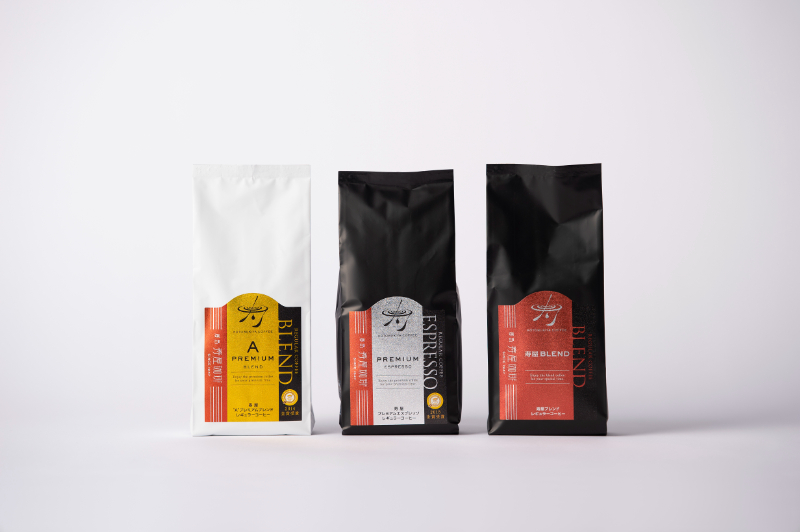
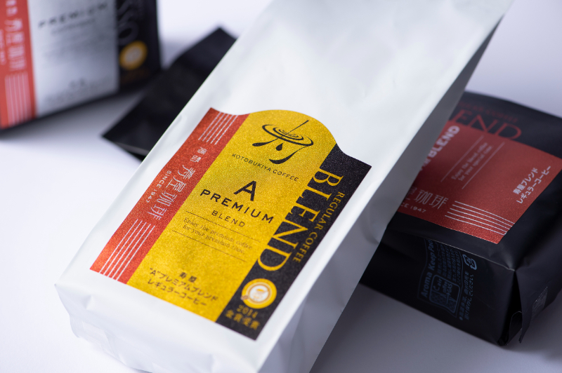
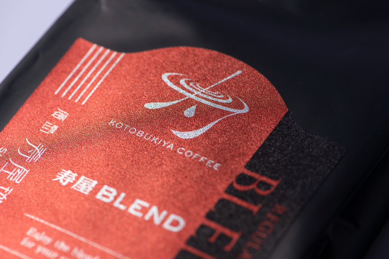
We proposed and received a design proposal for our flagship product, Kotobukiya A-Blend Coffee, which is made from carefully selected raw beans and carefully baked to perfection.
We designed and created a symbol that evokes the "Kotobuki" of Kotobukiya with coffee, and used special gold and silver shiny foil paper to express the elegance and luxury of the company's signature coffee blends.
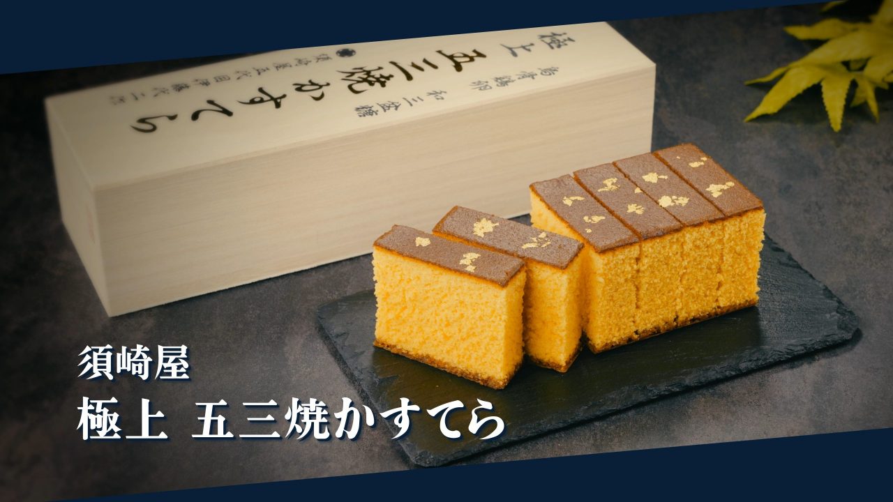
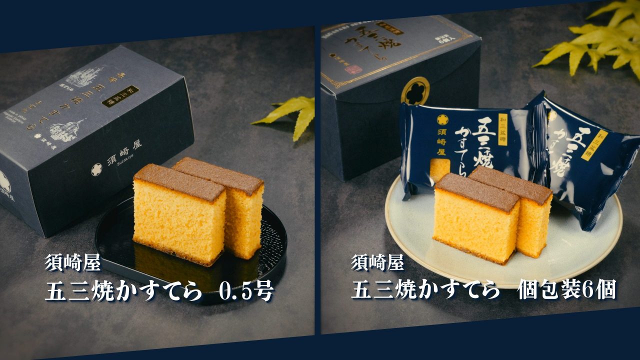
Nagasaki Castella White" package / Susakiya
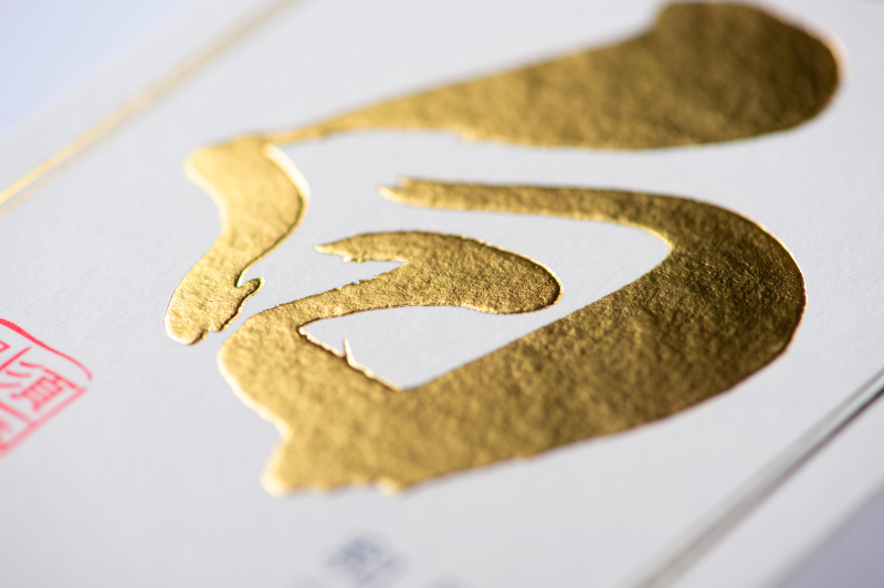
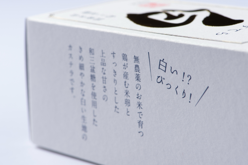
The overall color of the kastela is white to express a sense of luxury, as it is made of hand-baked, white dough made from the best materials available.
The "white" character, the pillar of the design, was written in large brush strokes by an in-house calligrapher, and the gold foil portion was embossed.
As differentiating elements, the FSC certification mark for forest conservation and the "CO2 Zero Printing" mark, which indicates that the product was manufactured in an environmentally friendly factory, are also displayed.
We were particular about the paper quality, and after trying several base papers, we finally adopted "Fritter 90k + back white coated ball 310g" which has a soft, cotton-like texture.
By creating a simple yet striking design with a luxurious feel, we were able to make the product stand out on the sales floor.
Later, I was also in charge of designing and producing sales promotion tools and creating a sales floor that matched the product image.
Sweet Potato Shochu "Hamako 10-year storage" label / Fukiage Shochu Co.
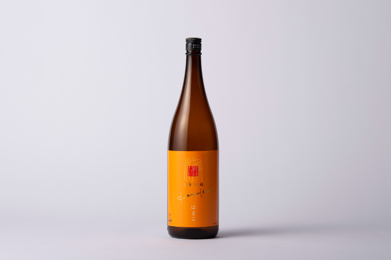
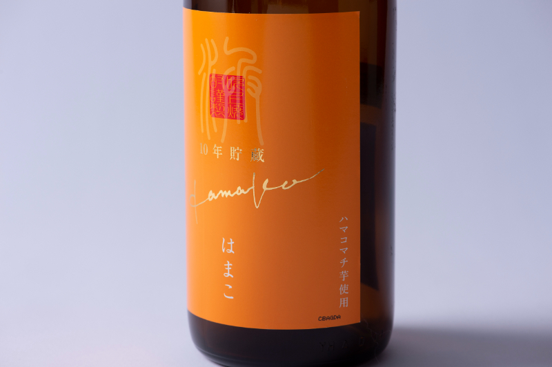
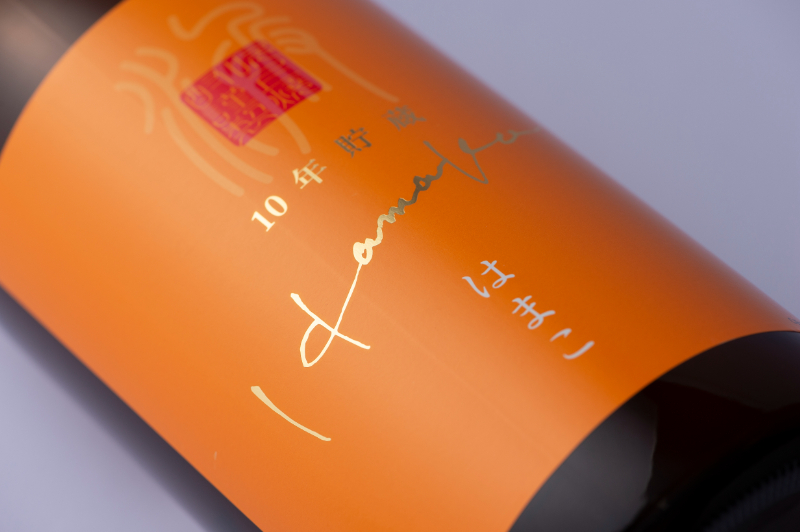
At the time of the request, we had not yet decided on the name of the product other than to use the "Hamakomachi" variety of sweet potato, but we wanted a design that did not look like a conventional product, targeting a younger demographic.
Marushin proposed a simple but eye-catching design on the sales floor, along with the product name "Hamako," which is easy to call and remember.
For the base paper, an art paper type that can be machine laminated was selected.
By partially applying gold foil, the label expresses added value while keeping costs down.
Sake "Taki Series" label / Narutaki Shuzo
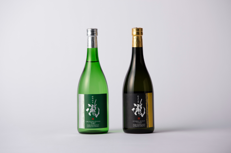
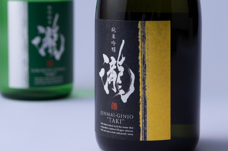
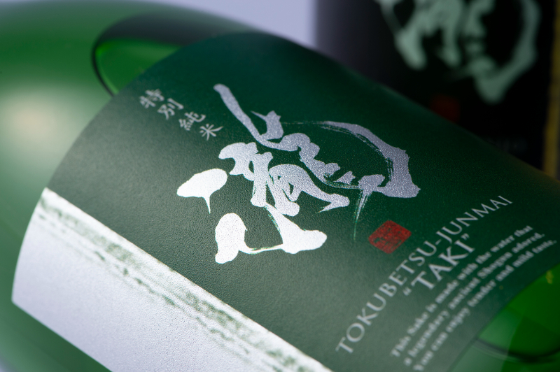
The company wanted a label design with a refreshing image of clean water flowing from a waterfall to accompany the launch of a new "Taki" brand as a limited distribution product.
The design features the word "waterfall" written by an in-house calligrapher at the center of the design, with a silver-pica base that adds texture and sparkle to create an overall fresh image.
The design was highly evaluated and adopted.
Landing page (LP) for "Karada Yokokobu Seaweed Plus"/Sugi Seika Co.
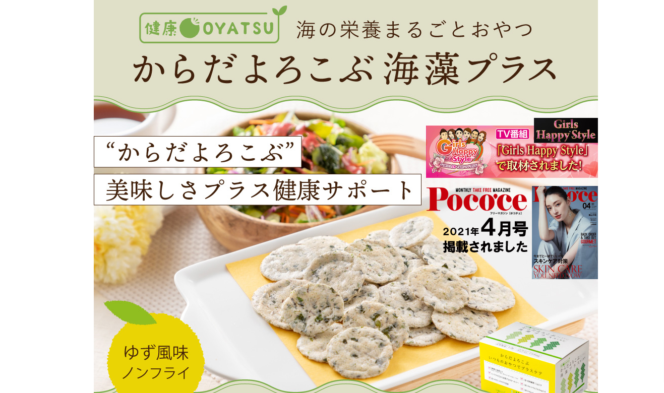
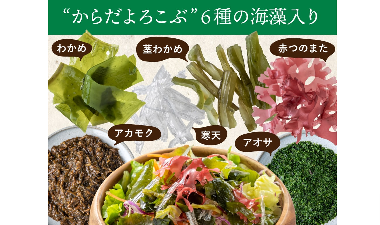
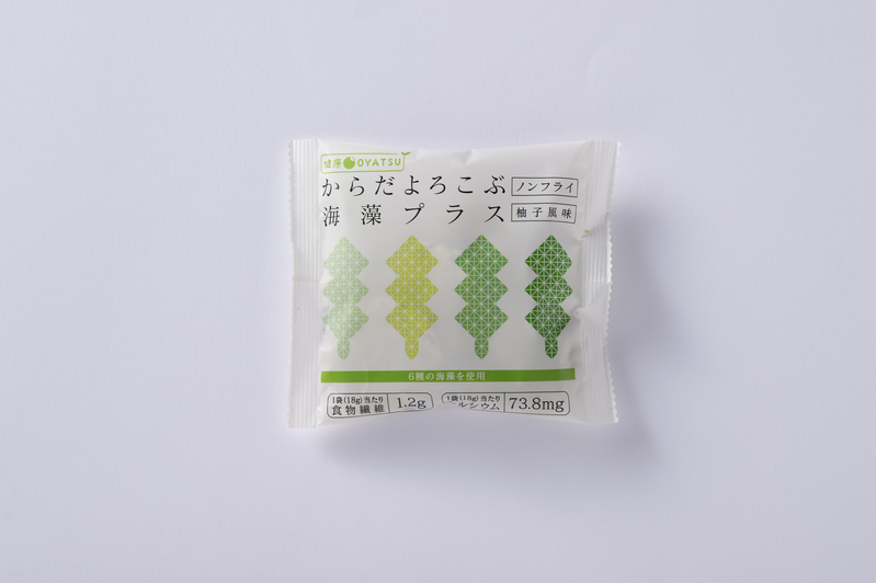
Since we were in charge of the product's package design, we were asked to create an LP to convey the product's appeal.
Elements of the package design were incorporated directly into the LP design, and the design was linked so that the product and product page would have a unified feel.
In addition, the structure was based not only on design but also on consumer psychology.
Because the appeal points of the product were clear, the LP was able to fully convey the appeal of the product to the target audience.
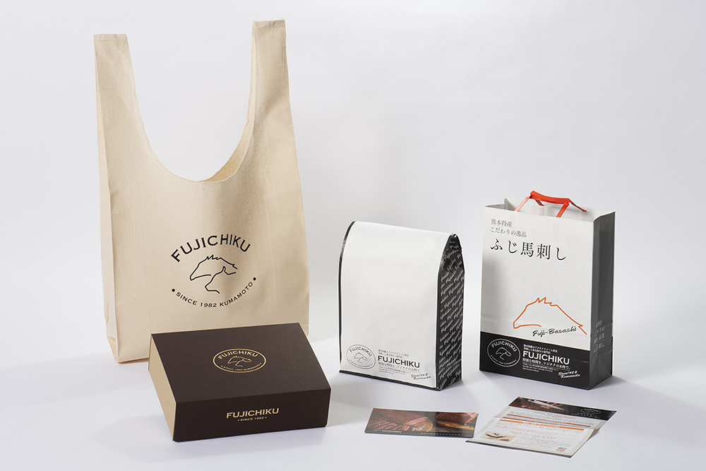
Mail order site / Mr. Fujichiku
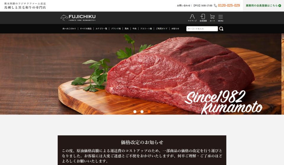
We produced a mail order website "Horse Sashimi and Kuroge Wagyu Beef Specialty Store" for Fujichiku, which produces horse sashimi in Kumamoto.
The company had opened a store in an online mall such as Rakuten Ichiba, but when launching a new in-house shopping site, they wanted a shopping site that would differentiate them from their competitors.
Therefore, we proposed to create a new brand image by creating a Western-style worldview reminiscent of a European bar, thereby removing the Japanese image of horse sashimi.
In response to this, we not only built the mail-order website, but also designed the brand logo to be used and had our exclusive photographer shoot the images to be used on the site.
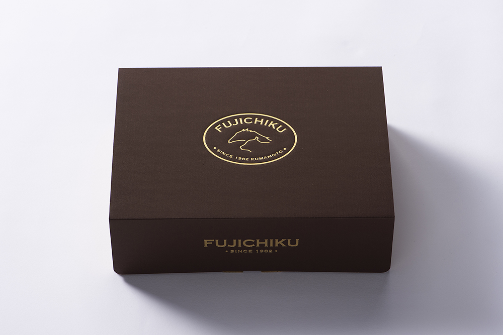
In addition, the company adopted our proposal to enhance the total product value by consistently producing labels and stickers, gift boxes, handbags, and pamphlets to match the design of the mail-order website.
Mail order site / Marumatsu Sangyo Co.
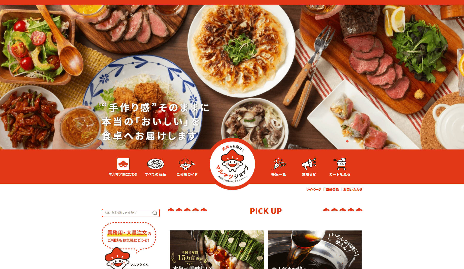
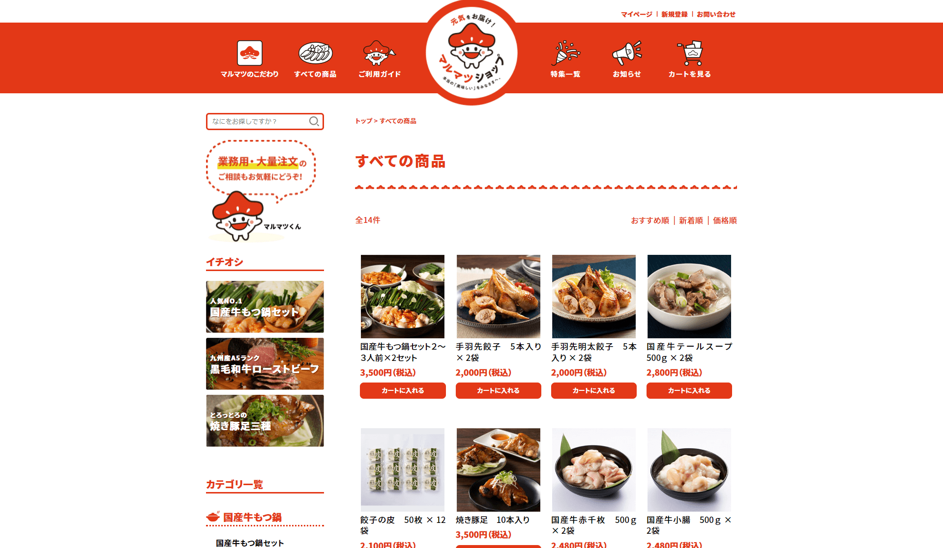
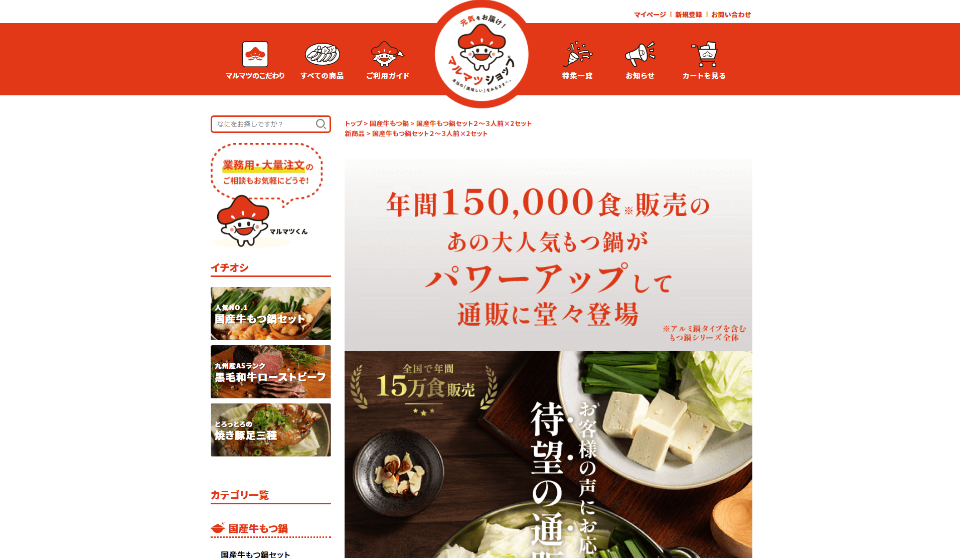
We created a mail order website for Marmatu Sangyo, a comprehensive meat manufacturer located in Katsuragawa-cho, Fukuoka Prefecture.
The company mainly manufactures products for food supermarkets, but due to many requests from the general public to purchase products directly from the company, the client requested the launch of a B-to-C mail-order website.
We proposed a design for the character “Marumatsu-kun” to match the company's "stamina food" image, based on the theme of a friendly mail-order website.
The fun is expressed through the leading lines and illustrations introduced by characters at various points on the site.
The company liked the design of "Marumatsu-kun" so much that it became an official character, and the character is now attached to products and other items.
Mail order site/Rakunoh Farm Takeshita
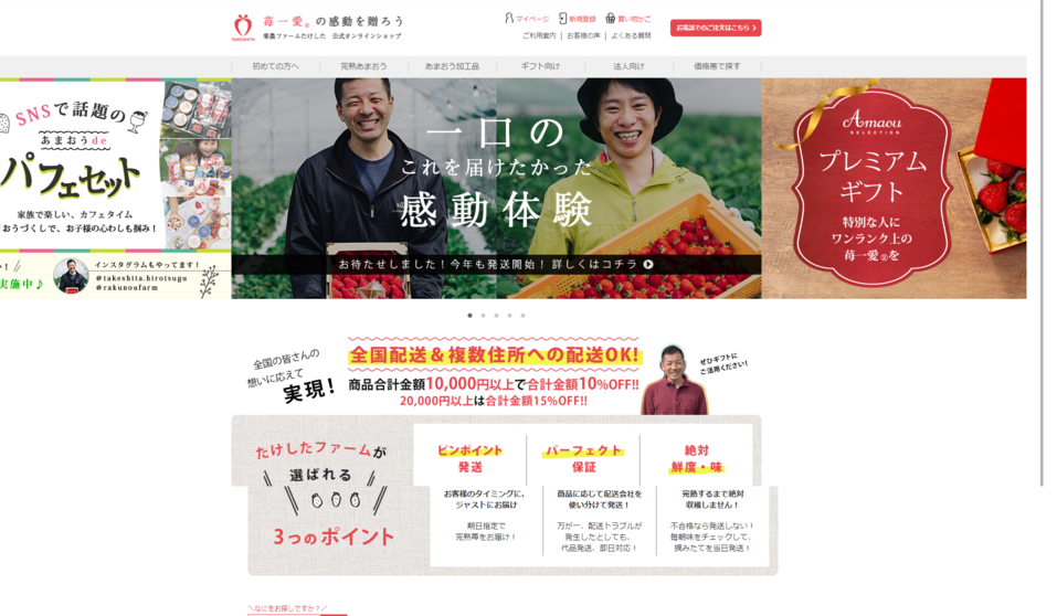
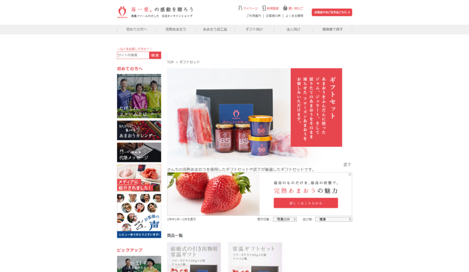
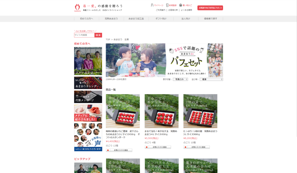
The "Official Online Shop" of Raku-Noh Farm Takeshita, a strawberry farmer in Okawa City, Fukuoka Prefecture, has been renewed.
At the time of the request, the start of strawberry reservations was just around the corner and renewal was required as quickly as possible.
Therefore, we first created a product LP of "Fully Ripe Amaou" to strengthen sales of our mainstay products. As a result, bookings increased three times compared to last year.
The site has since become a year-round sales site with increased appeal on the product pages for processed products.
Photography was also conducted both onsite and in the studio in order to prepare content that conveyed the producer's thoughts and high quality and photographs that matched that expression.
In addition to providing post-production management support for websites, we also create gift product package designs tailored to the target market.
Brand Site / Kyushu Yakuhin Kogyo Co.
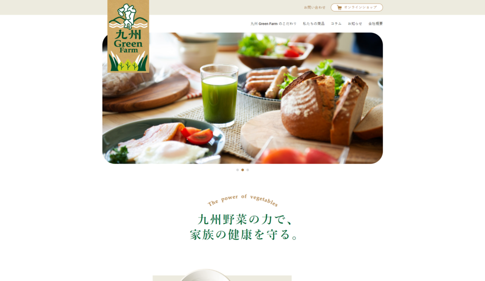
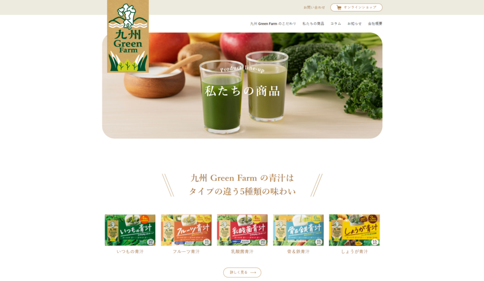
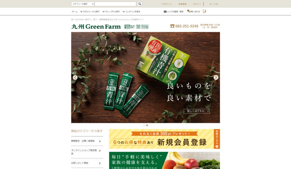
We created the brand website "Kyushu Green Farm" for Kyushu Yakuhin Kogyo, a manufacturer and seller of green juice.
The website was designed to convey the brand's world view and product appeal, targeting families, as Aojiru has a wide variety of flavors and is easy for the whole family to enjoy, even for small children. We were involved in the comprehensive development of the brand website, from photography to page production, paying particular attention to images that convey a “lifestyle with Aojiru.
In addition to the "Kyuguri Tsushin" article submission function, which is designed to be an information transmission site for consumers, the product list page also leads to a mail order site for product purchases, and so on.
Mail order site / Tanaka Seimen Co.
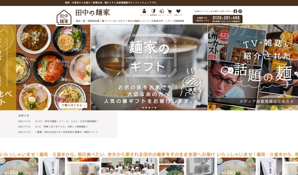
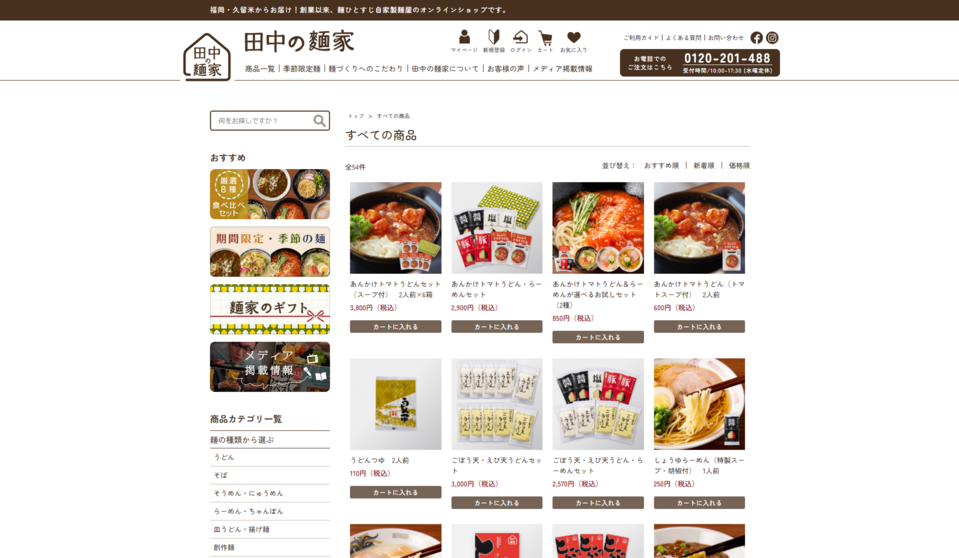
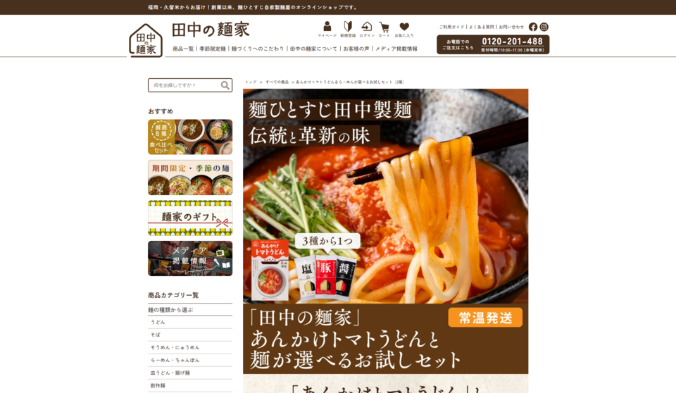
We renewed the mail order site of Tanaka Seimen, a noodle factory in Kurume City, Fukuoka Prefecture.
In order to strengthen the mail-order business, the client requested a review of the existing mail-order site as well, and we designed the pages to emphasize trial sets and seasonal products that would lead to sales promotions, as well as to change the cart system.
We also provided full support to the mail-order staff in charge of mail-order sales, including lectures on how to use the cart system and advice on order-taking and shipping systems, all of which were necessary to strengthen the mail-order business.
Corporate site, Mail order site / Hita Soy Sauce
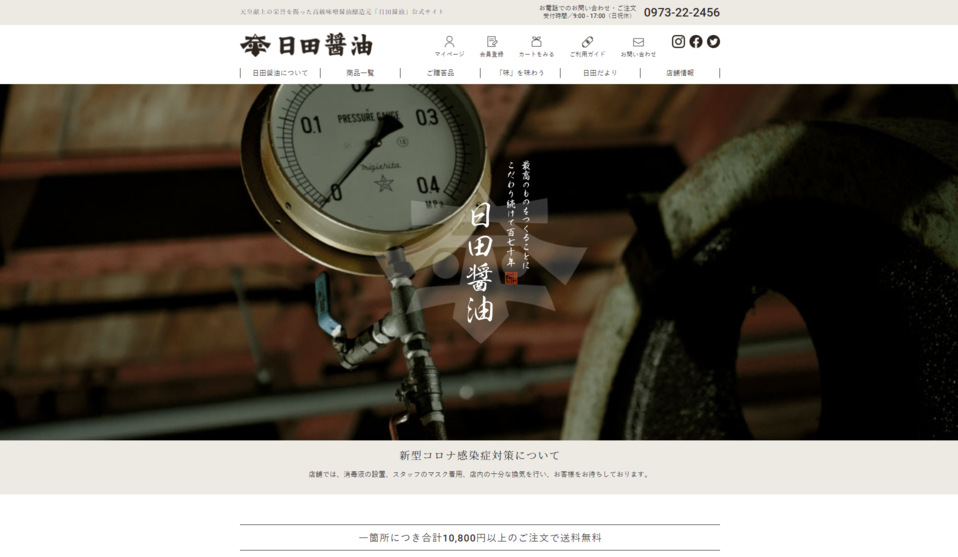
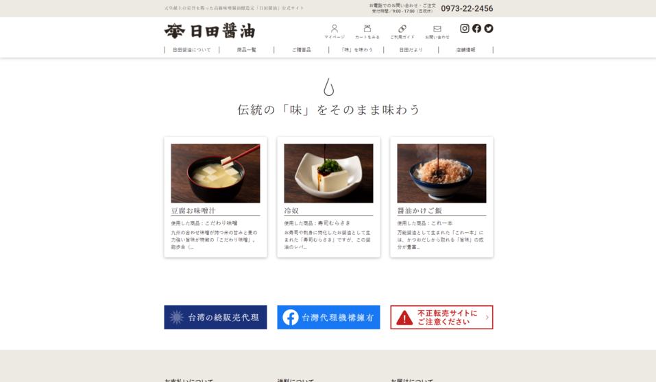
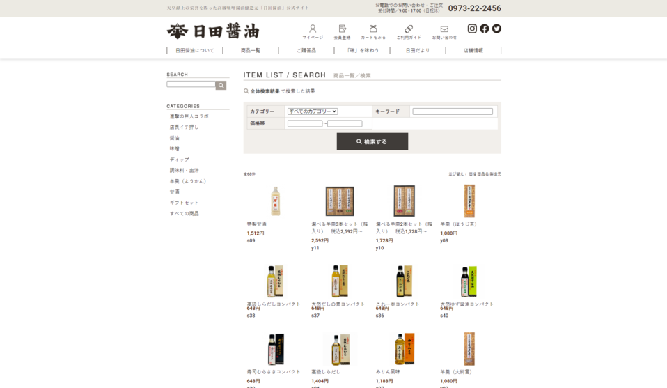
We created a corporate and mail order website for Hita Soy Sauce, a manufacturer and distributor of miso and soy sauce in Hita City, Oita Prefecture.
We wish to redesign the existing mail order site and make it easier for consumers to purchase.
We proposed integrating the separate corporate and mail-order websites, focusing on the three main products and designing the main products to stand out on the TOP page.
We have made it easy for first-time users to understand information about the company and its products, and easy for them to select products.
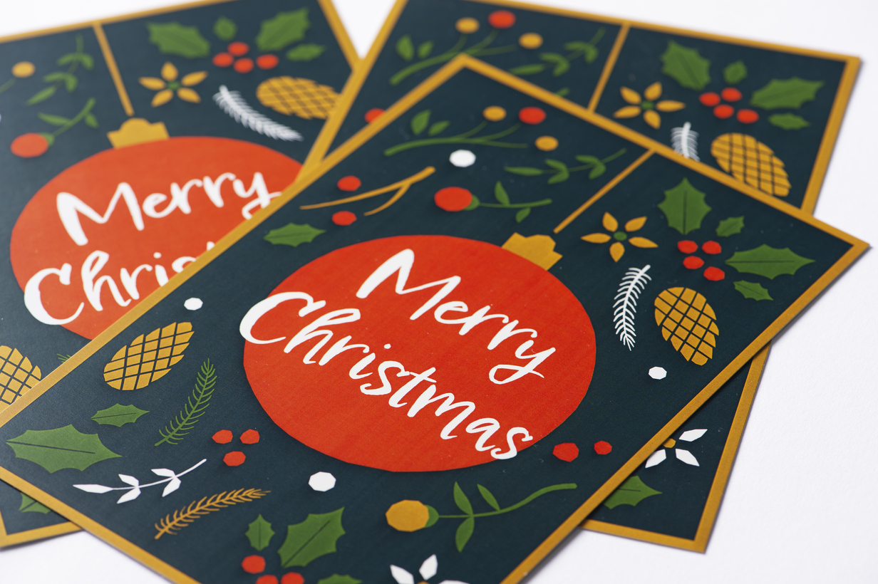
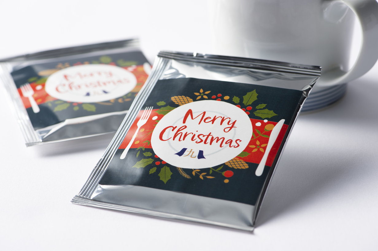
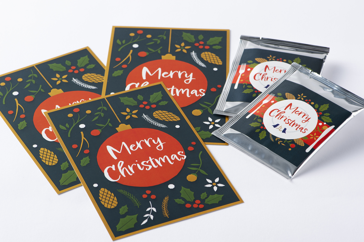
Cards for Christmas DM, coffee labels/Kyusyu Oyakudome Honpo
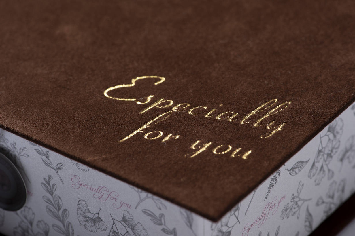
Cheesecake Gift Box / Kyushu Oretaki Honpo
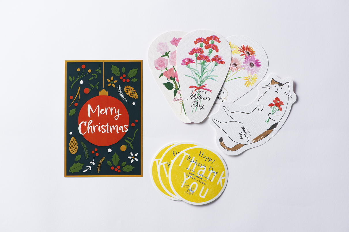
Various postcards/Kyushu Oyakudo Honpo
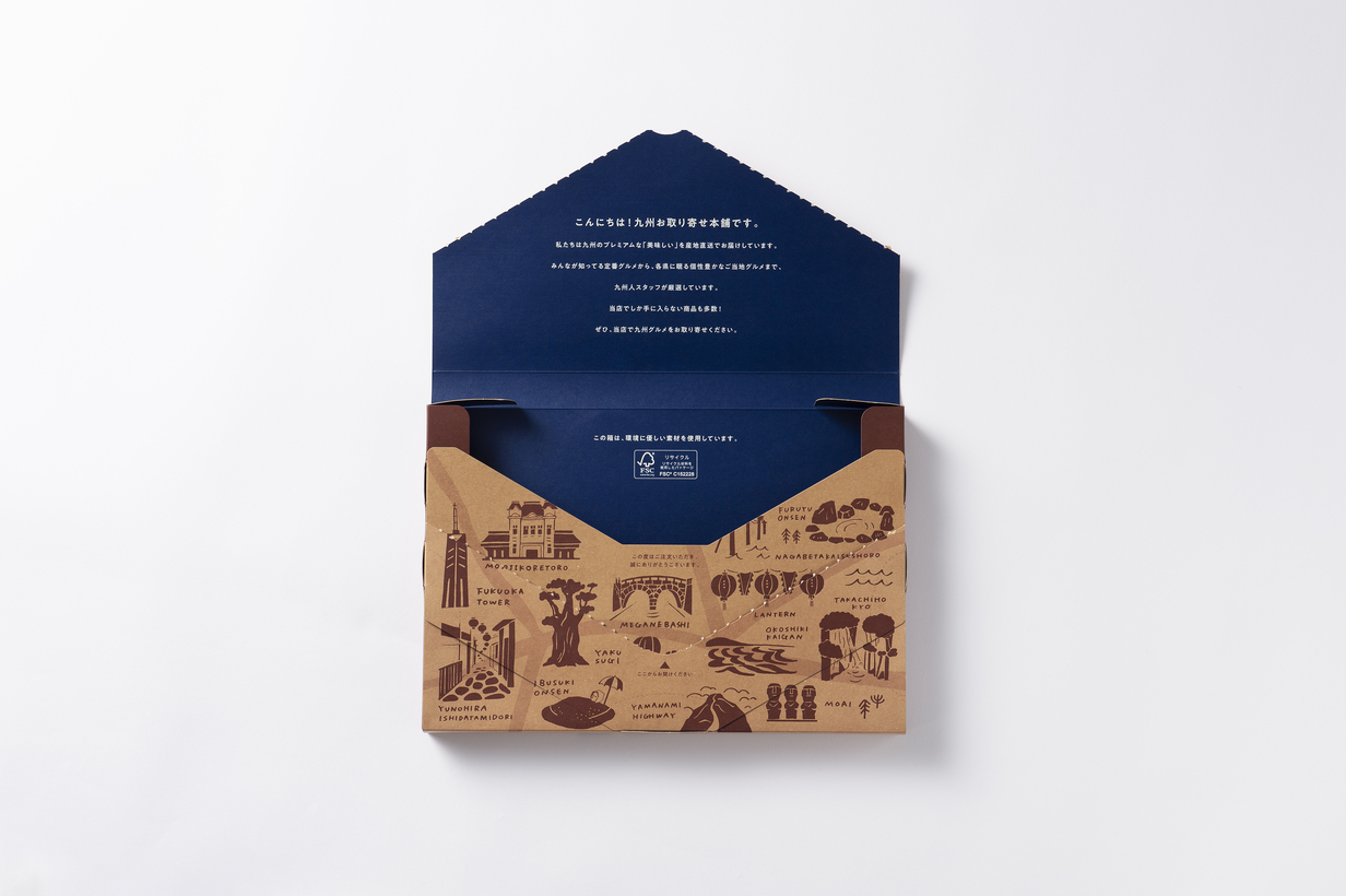
Boxes for mail delivery / Kyushu Oyakayori Honpo
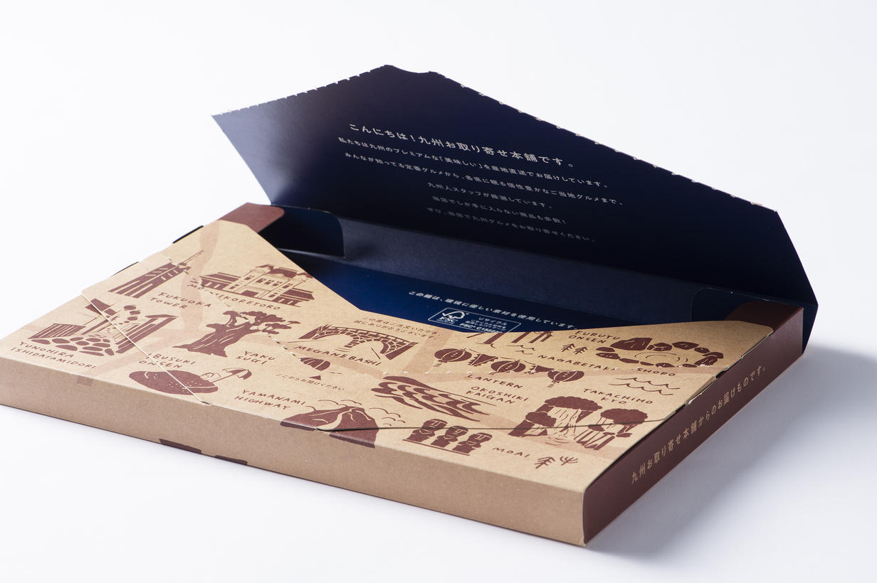
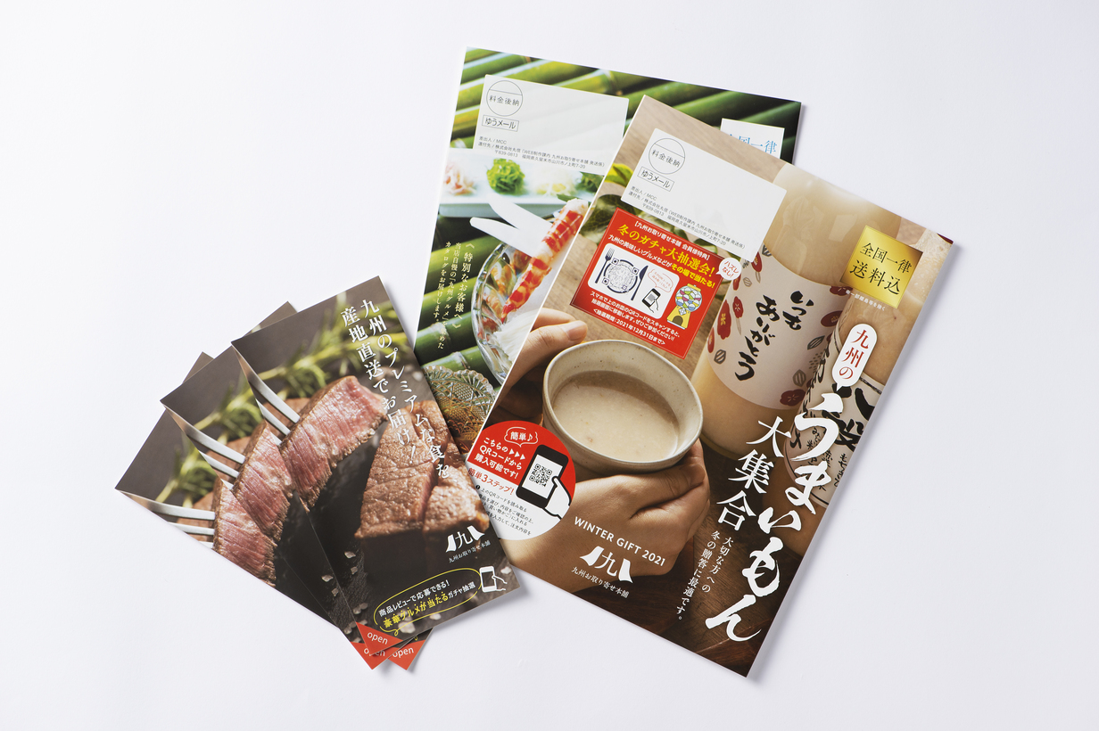
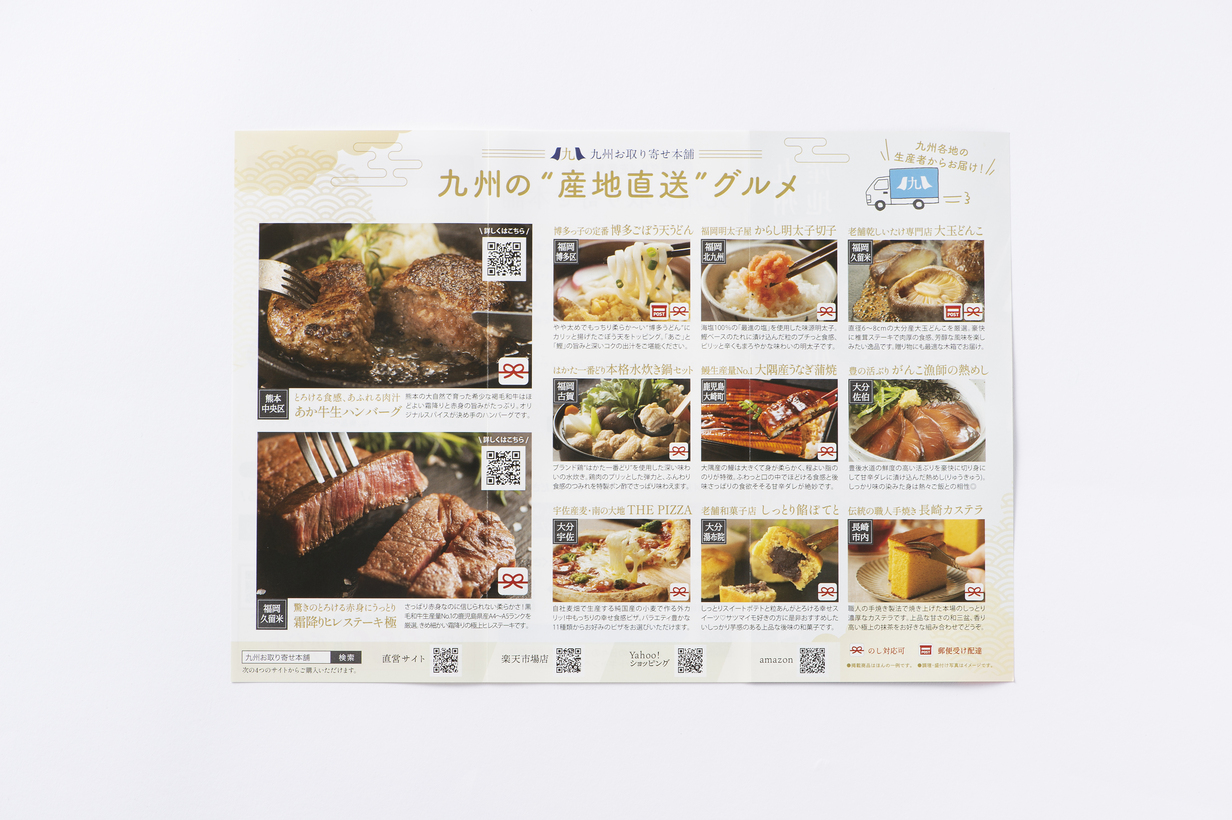
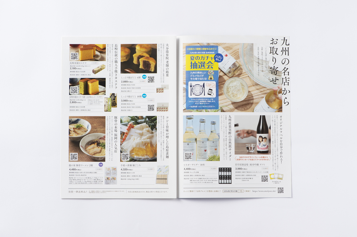
Leaflet included in the package, DM catalog/Kyusyu Oyakoyori Honpo
Hasami-ware cup gift box / Kyushu Oyaki-Honpo
Sake "NUDY" label / Wakatakeya Brewery
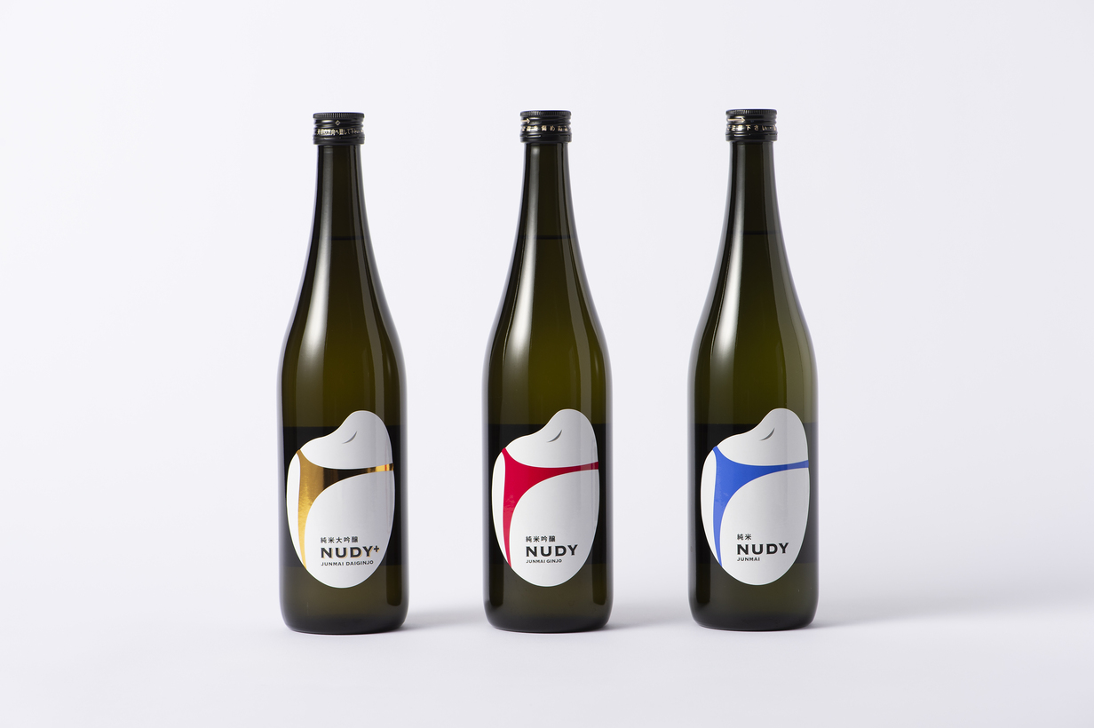
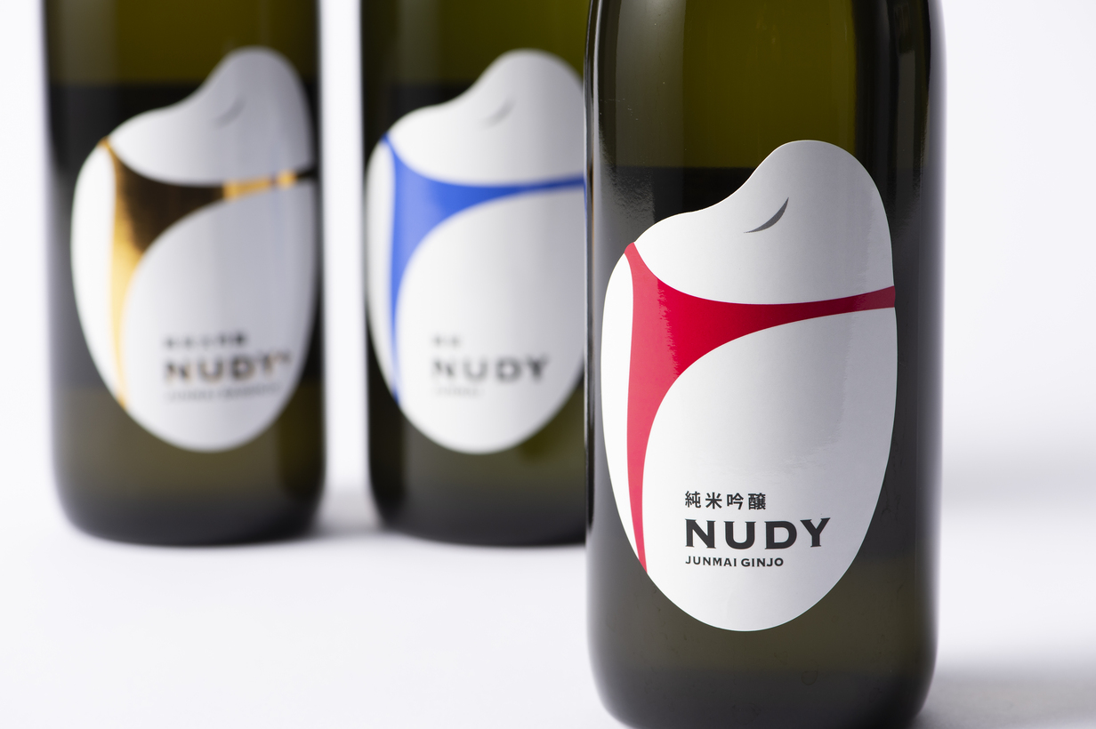
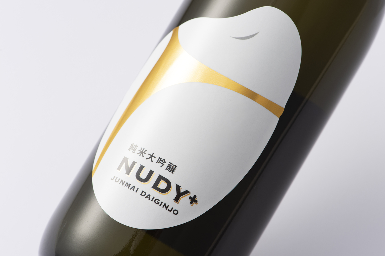
Sake Label / Wakatakeya Sake Brewery

Kouji amazake label / Arrows International, Inc.


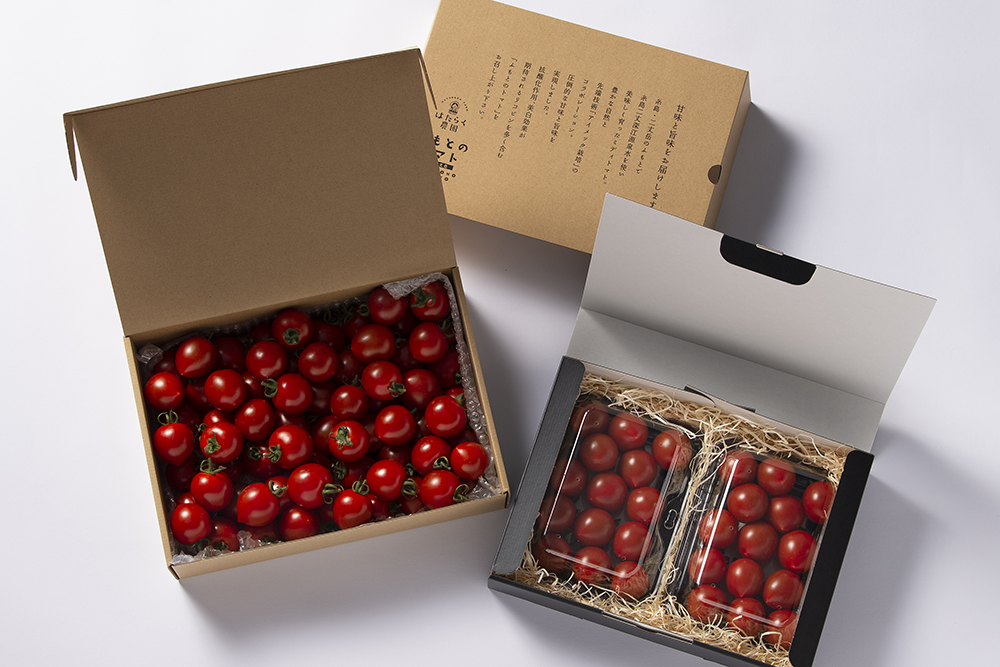
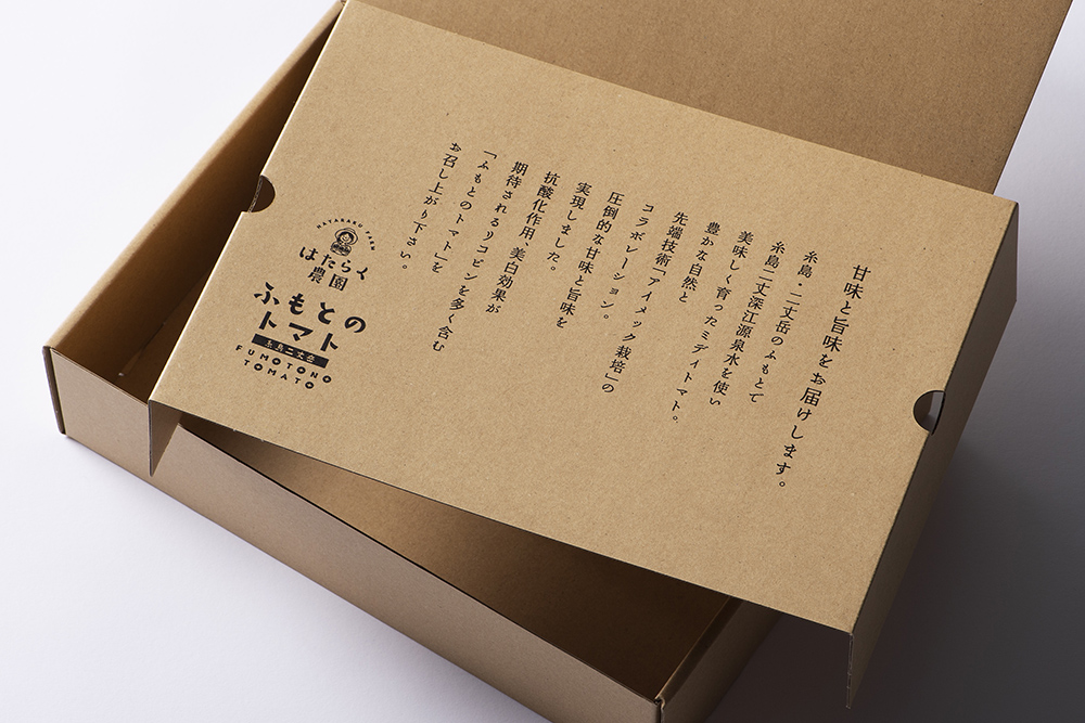
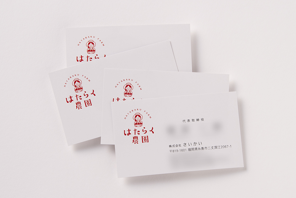
Branding of Itoshima tomatoes / Mr. Saikai
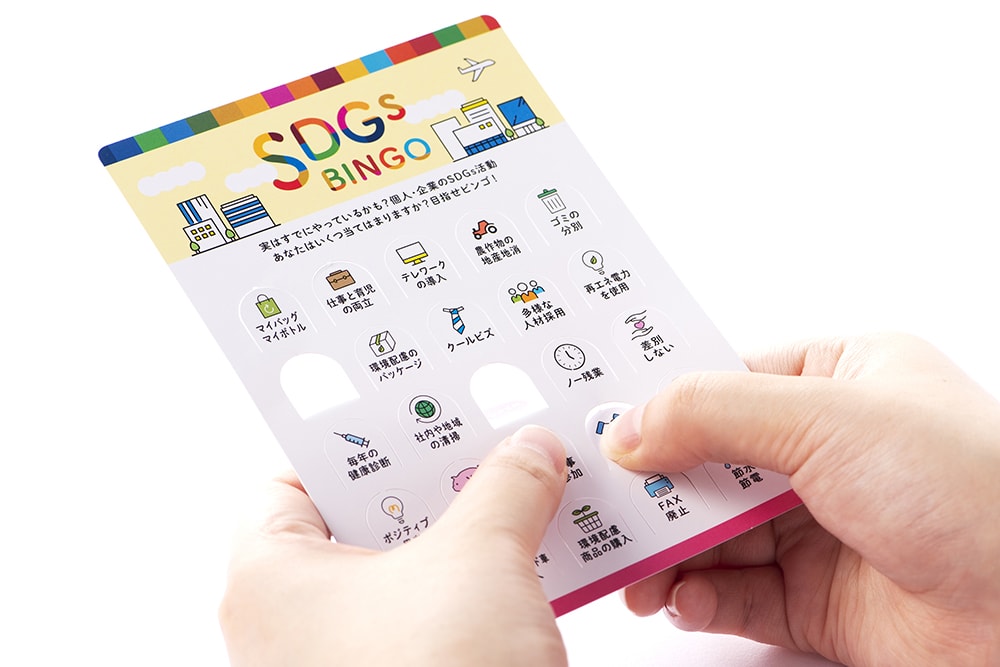
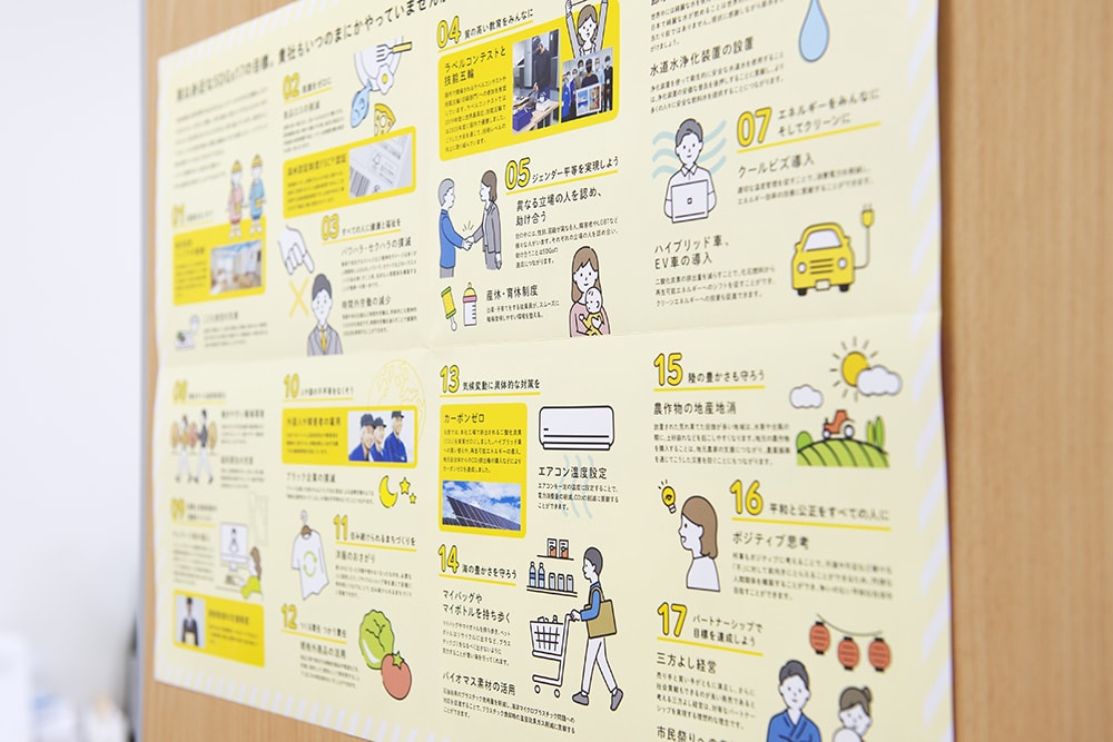
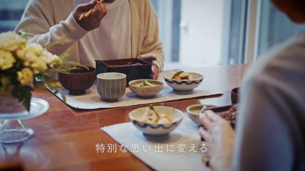
SDGs for the Future of the Earth DM/Marushin
Easy♪ Asian Table" series bags / Mr. Higashino Takumi


Since the product is easy and simple to prepare for busy housewives, the packaging includes photos of example dishes served on rice or bread. In addition, the illustrations depict women dressed in ethnic costumes from different Asian countries: keema curry, taco rice, and giao pao.
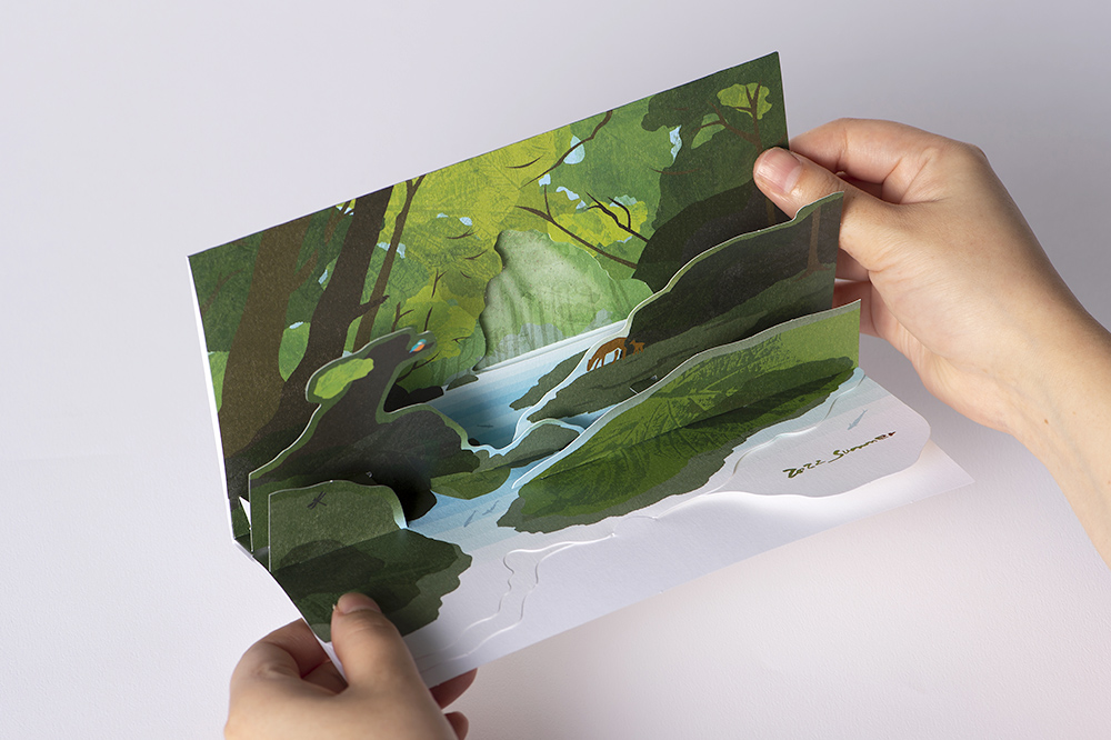
Card DM that pops up in three dimensions / Marushin

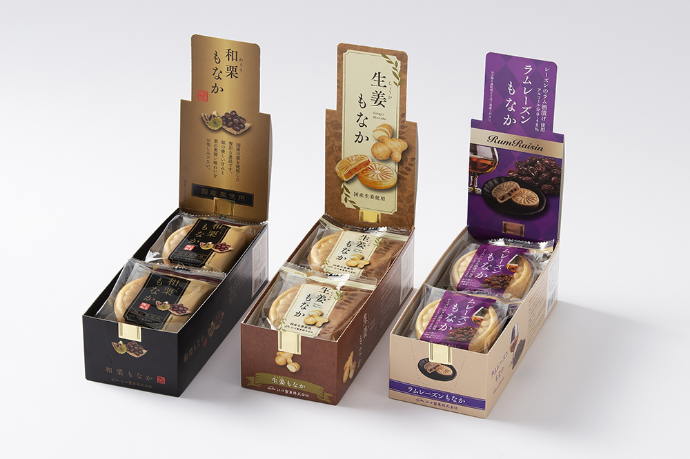
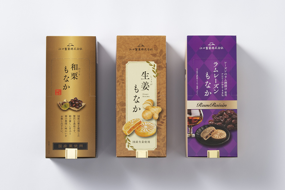
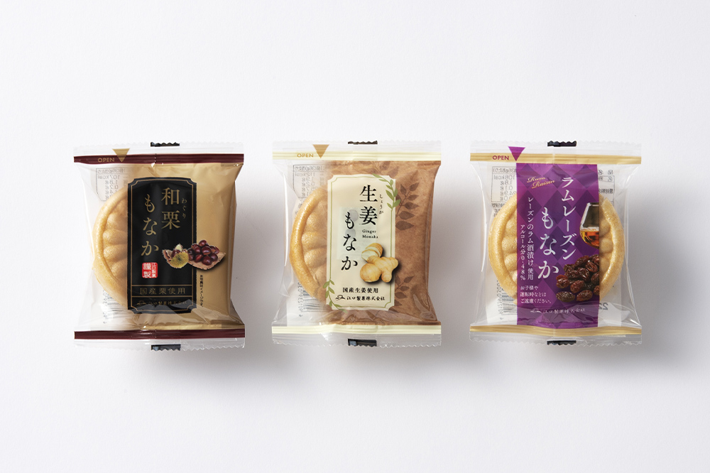
Package and bag for display / Eguchi Confectionery
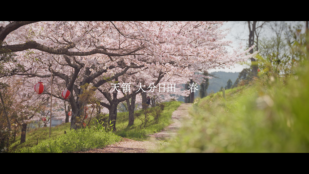
Branding Video / Three Generations of Okawa
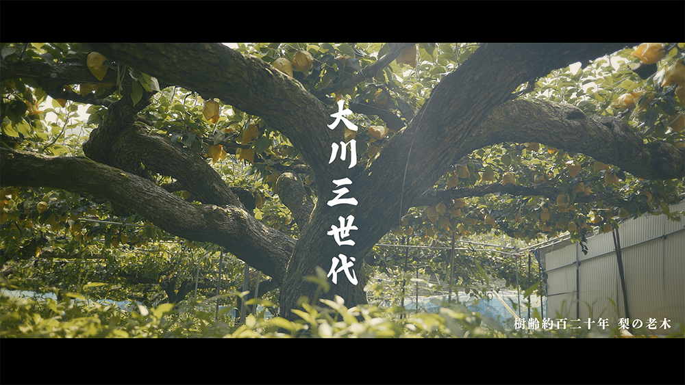
Three Generations of Okawa: Click here to watch the branding and company introduction video (youtube)
Digital Signage / Marushin
Marushin can create data for videos and slides to be shown on digital signage.
Click here for a video of digital signage (youtube)
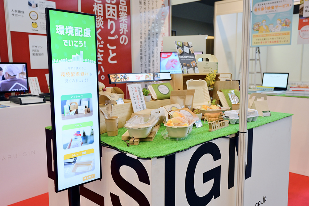
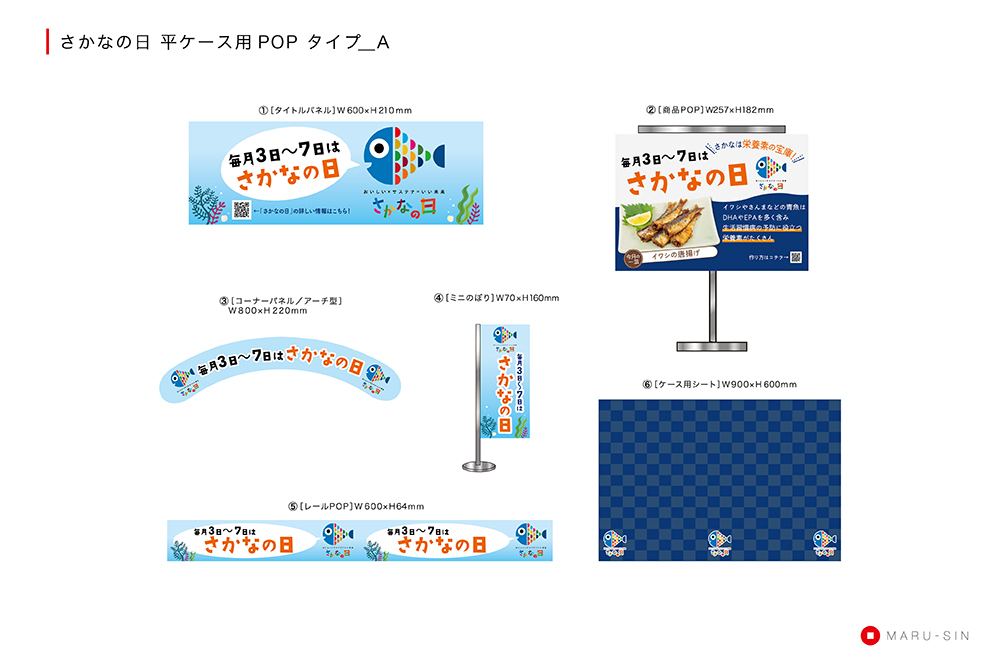
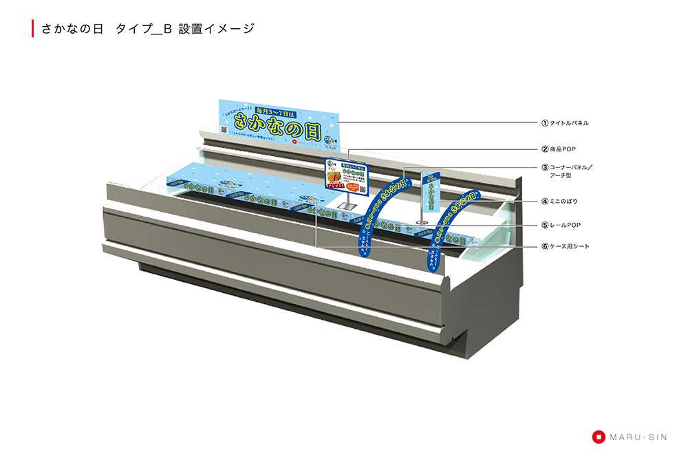
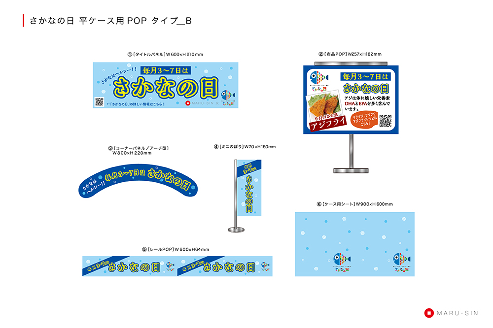
POP image of the sales floor for "Sakana no Hi" (Fish Day) / Marunouchi
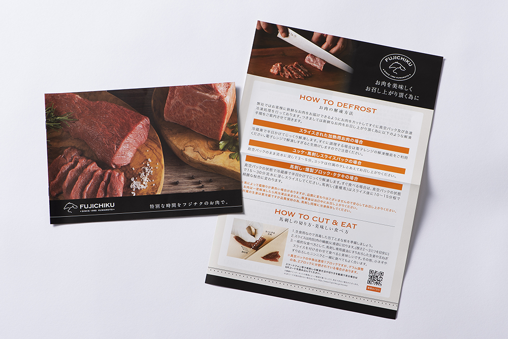
Mail order related materials / Fujichiku Co.
Introduction Video of the Museum / Hita Soy Sauce
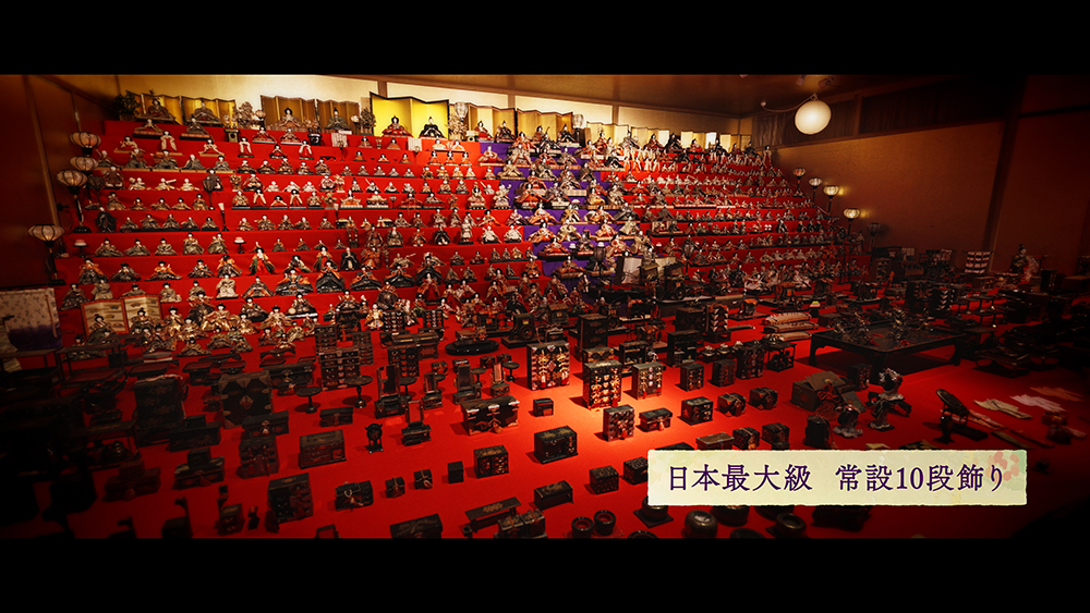
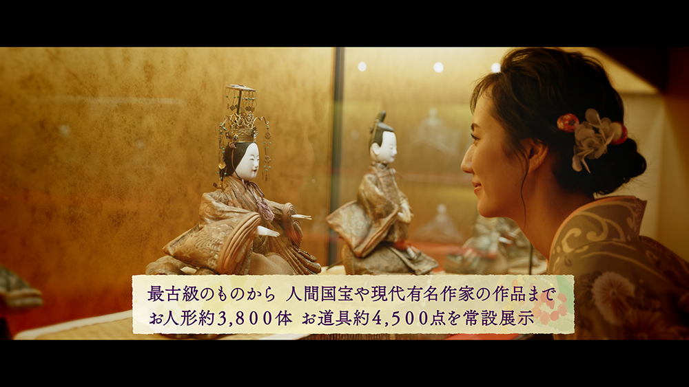
Click here for video (youtube)
Summer Festival Event Tools / Marushin
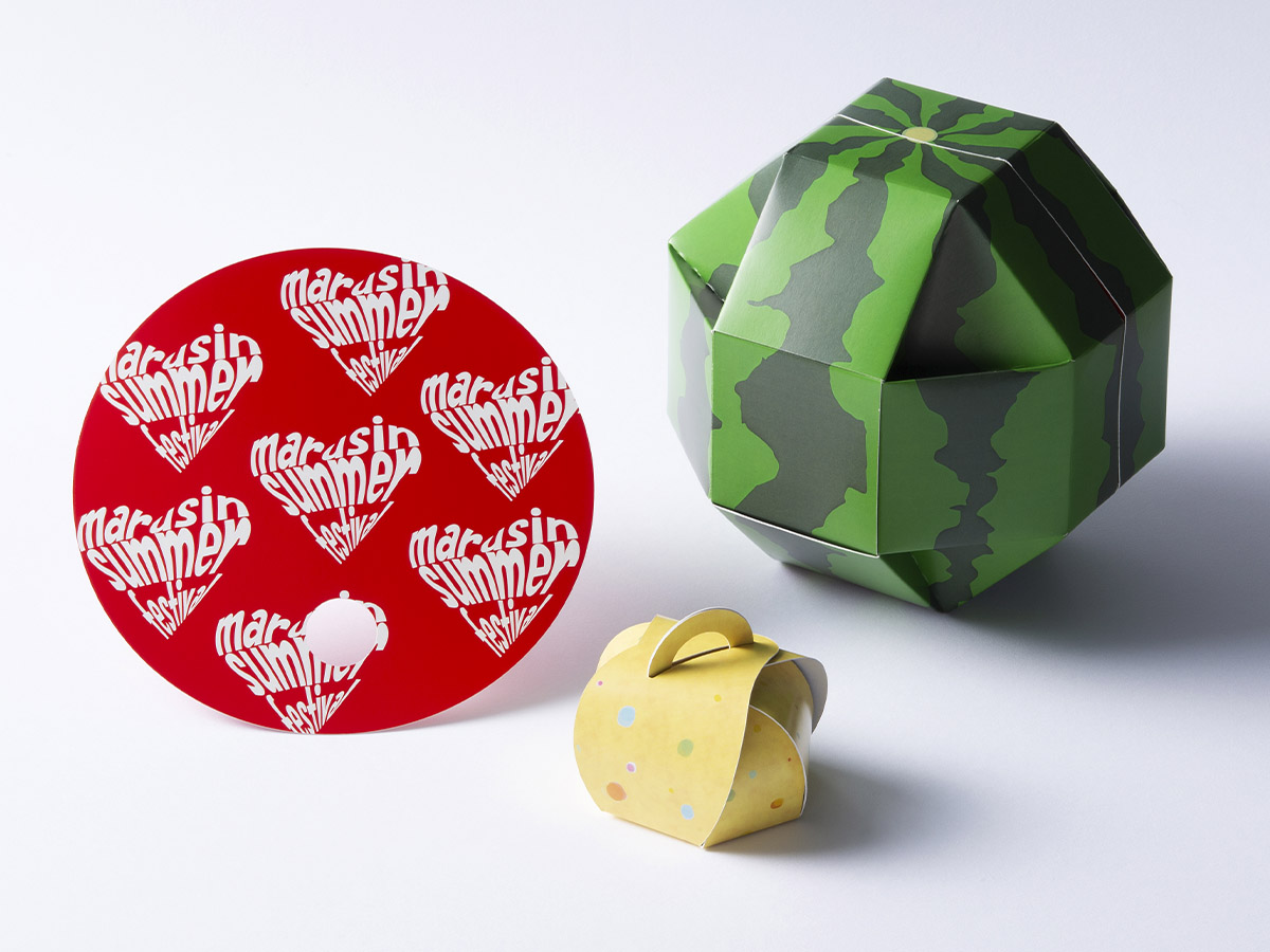
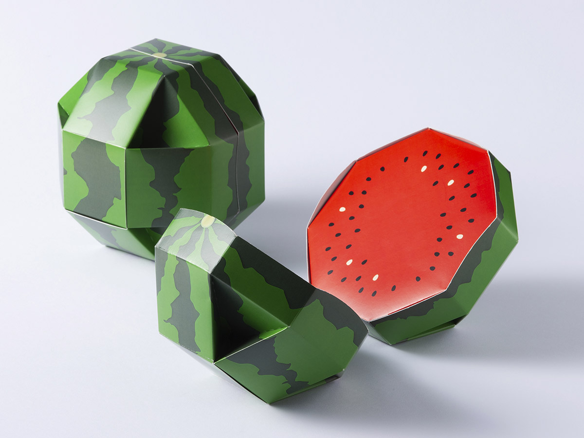
Designed to open upon impact, as in the original watermelon splitting process.
These promotional fans are indispensable for events. Printed on both sides with a cute design, they are a tool that can be held in the hand.
<Environmentally friendly paper yo-yo. The handle is attached with a rubber, and candy can be put inside for fun.
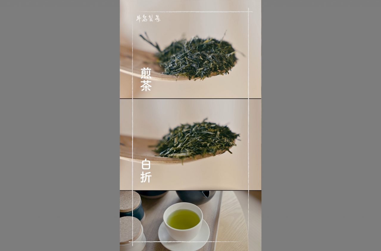
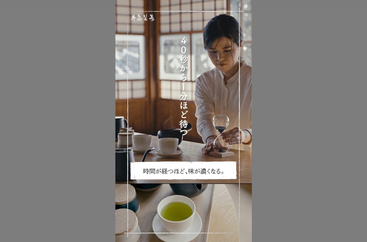
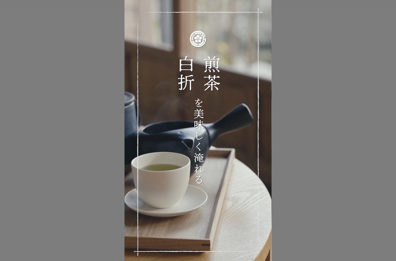
SNS short video / Ushijima Tea Manufacturing Co.
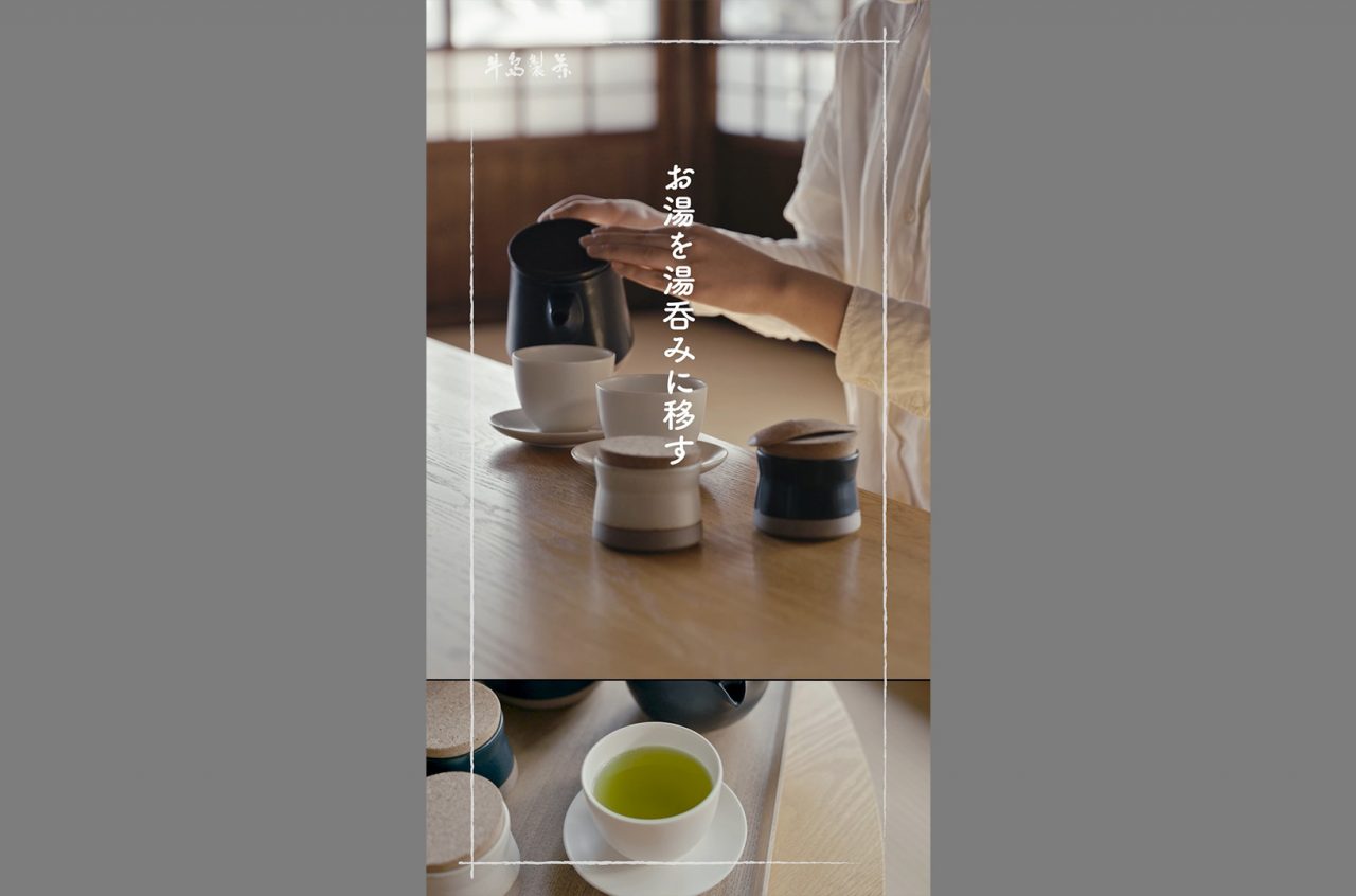
Click here for video (youtube)
Digital Signage Video / Suzakiya
Recipe video / Mr. Weda
Click here for video (youtube)
350th Anniversary Bottle Label / Ohga Sake Brewery
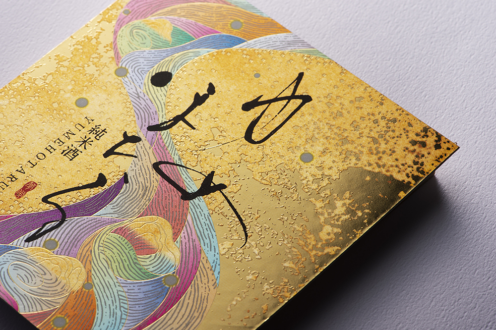
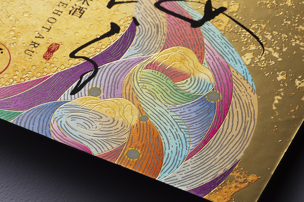
In keeping with the name of the product, we have used gorgeous yet slightly subdued colors to imitate elegant running water, fantastically expressing ”fireflies” dancing in a dream.
The base paper is made of silver foil. Finally, gold foil stamping was applied to give the label a three-dimensional effect, creating a delicate yet luxurious atmosphere.
The label was awarded "Best of the Best," the highest award in the Combination category, in the World Label Contest 2023.
*"Best of the Best" is the world's number one award, presented in five categories for each printing method, among the top prizes selected by the World Label Contest 2023 judging panel held in conjunction with the L9 World Label Contest 2023.
Mail order site / Fukunaga Sangyo Co.
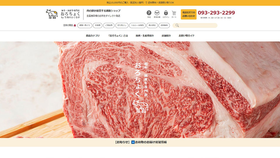
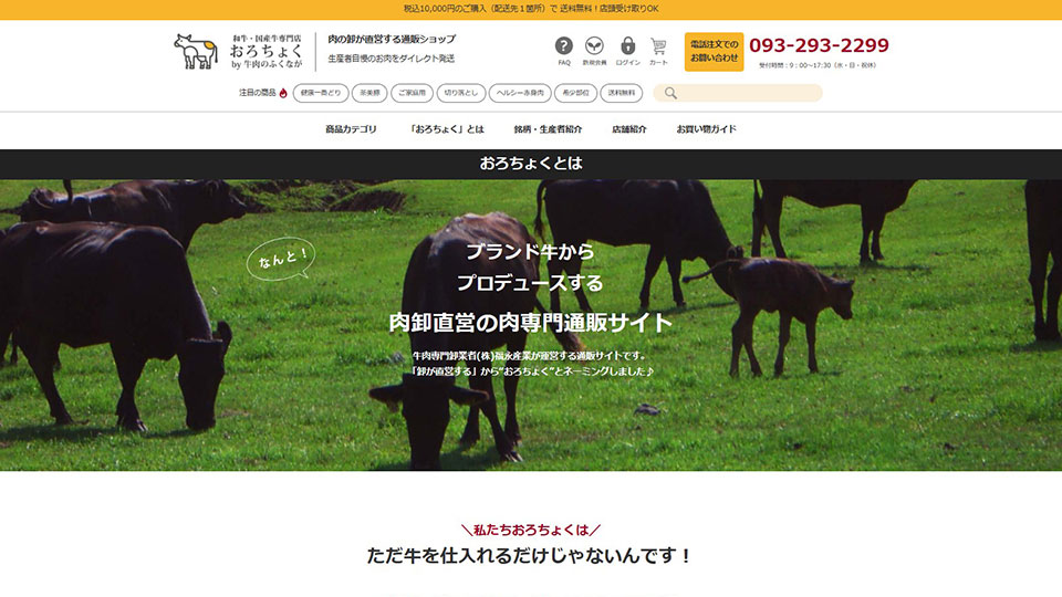
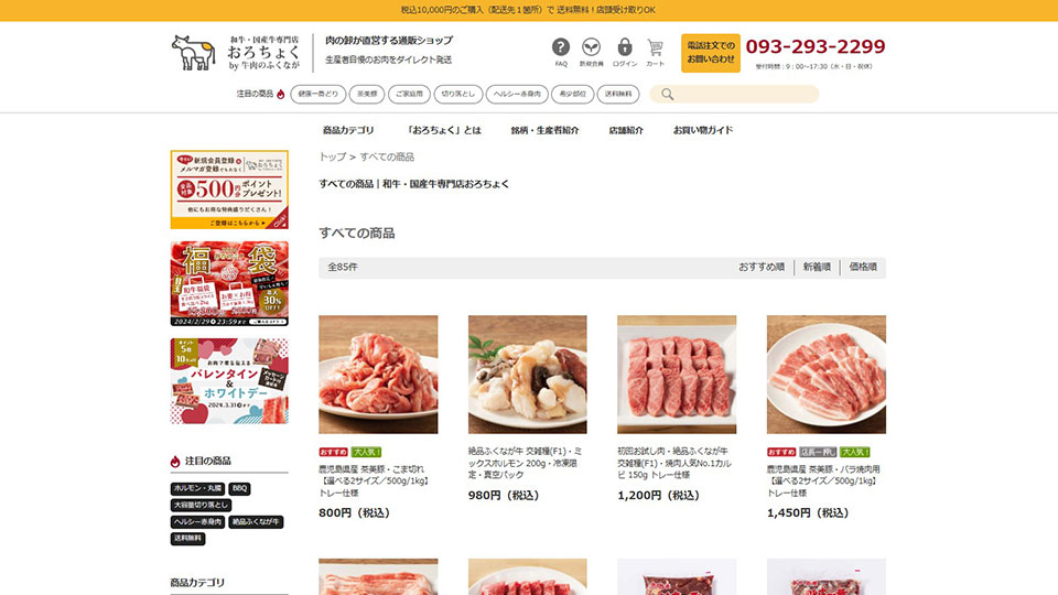
We renewed and produced the mail order site "Orokuji" for Fukunaga Sangyo, a wholesaler of Wagyu beef and domestic beef.
The site is designed to appeal to the strengths of Fukunaga Sangyo, including a page introducing its attractive brand of beef, a food comparison, and rare parts of beef. Some of the photos on the site were also taken by Marushin.
Box for cake / Patisserie Magian
Branding Video / noaru corporation
Click here to watch the video
Click here to go to the video page
Digital Signage / Honke Bundan-do
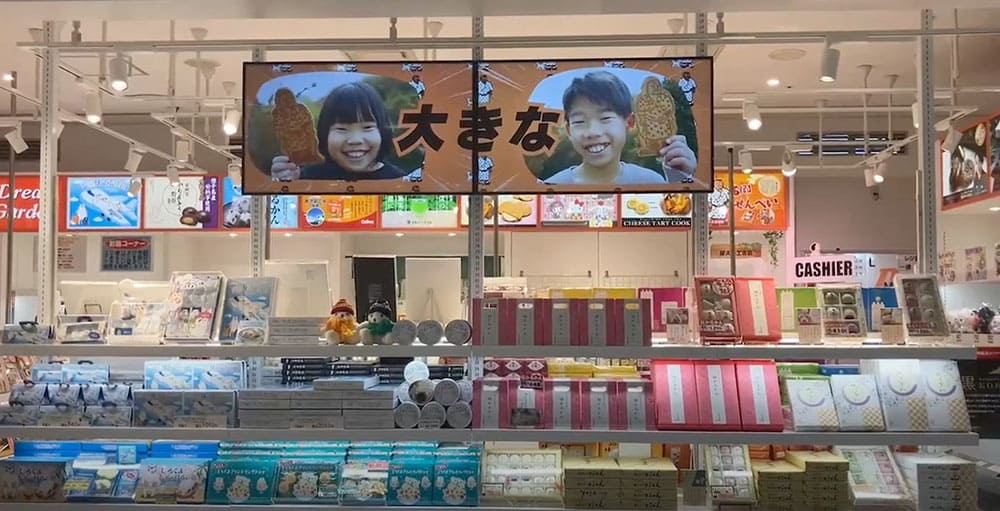
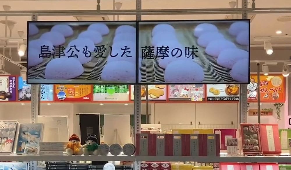
The dynamic images of the "multi-display," which links two screens together, promote traditional confections such as "Saigo senbei" and "karukan. The "multi-display" makes it easier to catch the eyes of passersby, and strongly impresses them as potential souvenirs.
We offer one-stop services from planning, filming, editing, and data preparation for multiple displays, and can provide flexible proposals tailored to your needs, including the simultaneous production of videos in sizes that can be used on websites and regular monitors.
Click here to watch the video (YouTube)
*The video is horizontal because it is one that flows on two screens.
SNS Video Advertisement / Kyushu Oyakayori Honpo
(ROAS 400%: e.g., ¥2 million in sales for ¥500,000 in advertising)
We have consistently performed everything from video production to advertisement management here.
Video advertisements are very effective in directly reaching potential customers who are not yet aware of the appeal of a product, which is difficult to convey through text or still images alone, and arousing their desire to purchase.
It is a powerful solution to acquire new customers and further expand sales in the e-commerce business.
Click here to watch the video (YouTube)
Explanatory video for foreign staff / food-hygiene.com
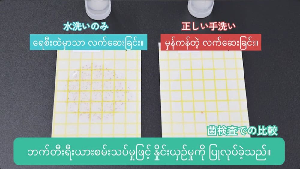
By introducing these multilingual food hygiene and operations manual videos, correct procedures and rules can be smoothly disseminated across language barriers.
This video is a one-stop production from planning to filming, editing, and multilingual message creation. Once created, the correct procedure can be conveyed to anyone in an easy-to-understand manner, simultaneously increasing training efficiency and ensuring uniform quality.
Click here to watch the video (in Vietnamese)
Click here to watch the video (in Indonesian)
Click here to watch the video (in Myanmar)
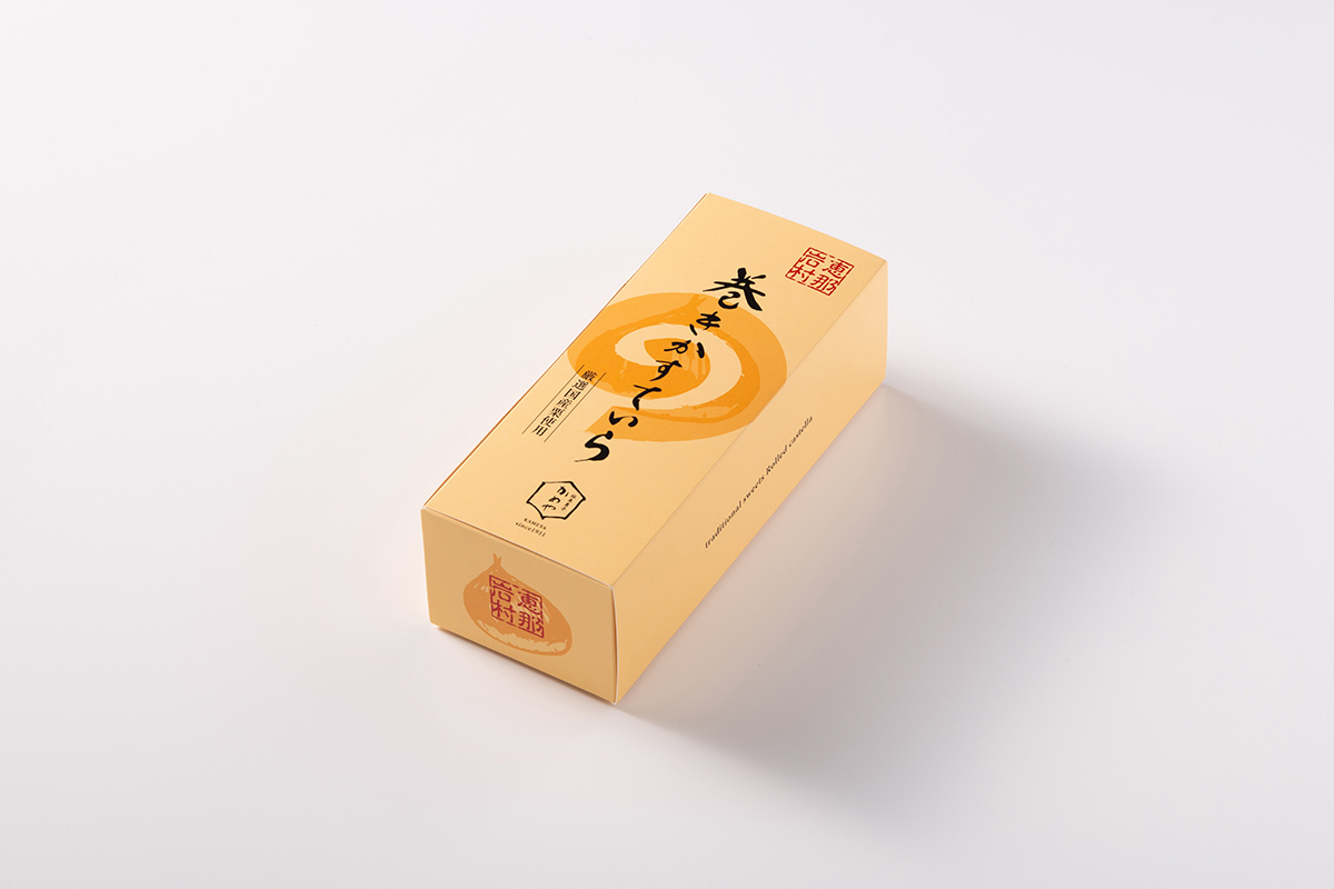
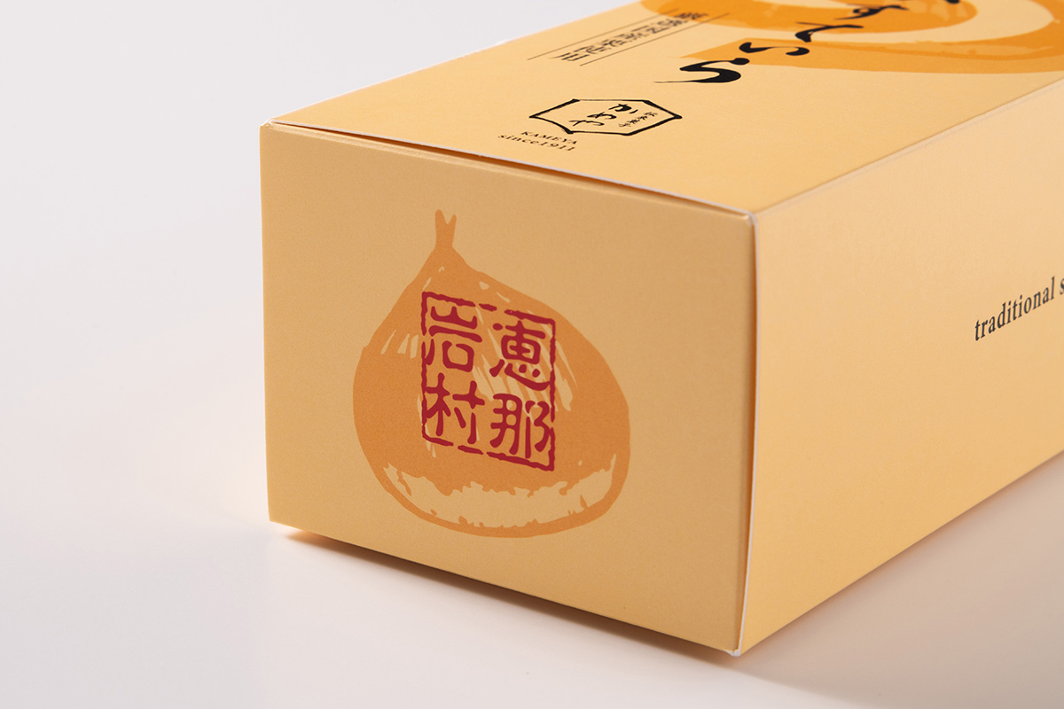
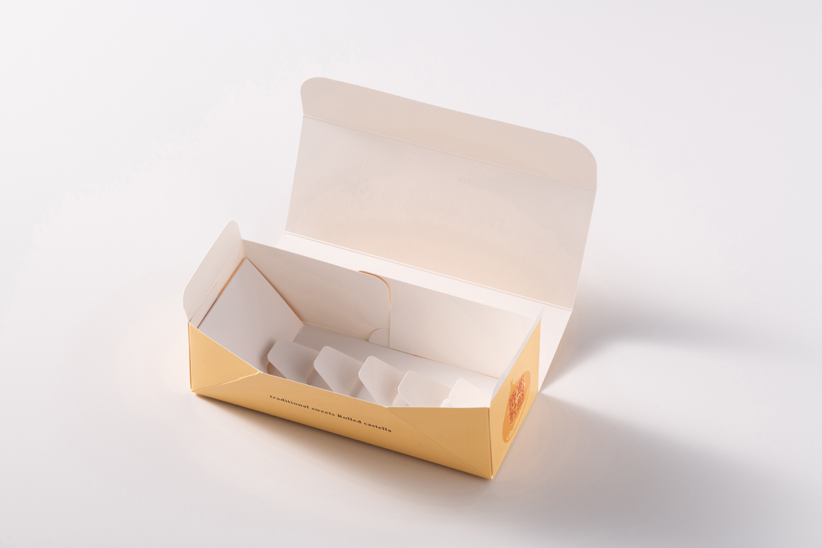
Japanese Confectionery Packaging / KAMEYA KASHIHO Co.